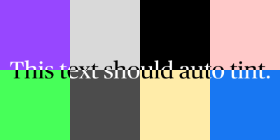
For a recent project, I was looking for updated mocks for Android OS and found this community file for Material You. While carrying over their status bar, I noticed it had a property called "Auto-Tint." Curious, I checked what it was for.
How. Freaking. Cool. It allows the status bar to go over any wallpaper and the colors of the time and icons automatically change from white to black depending on the color and content of the wallpaper. This is ✨magical✨ to me so I had to learn how it works.
The secret: multiple fills with multiple blend modes.
Let me preface this by saying I'm not entirely sure how blend modes work so I may not be explaining it as thoroughly as I should. The best I can do is take you along in my journey to attempt to do so.
While there are many resources that explain what the blend modes are in photo editing tools, I'll be using Adobe's overview:
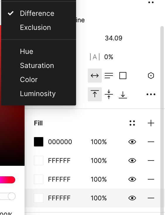
Because we're using white, using the "difference" blend mode will give the color's "complement" or show the exact opposite color. This mostly works for very dark or very light colors, but not as well for closer-to-the-middle hues.

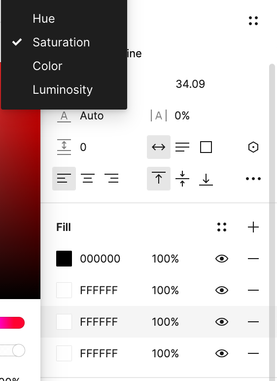
Adding a white layer with the "saturation" blend mode turns removes the color from the text, getting closer to using either white or black.

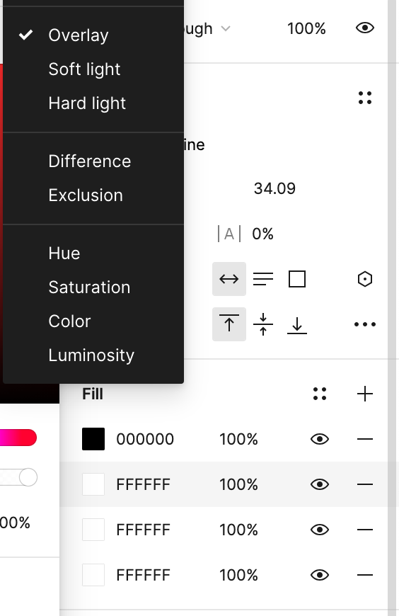
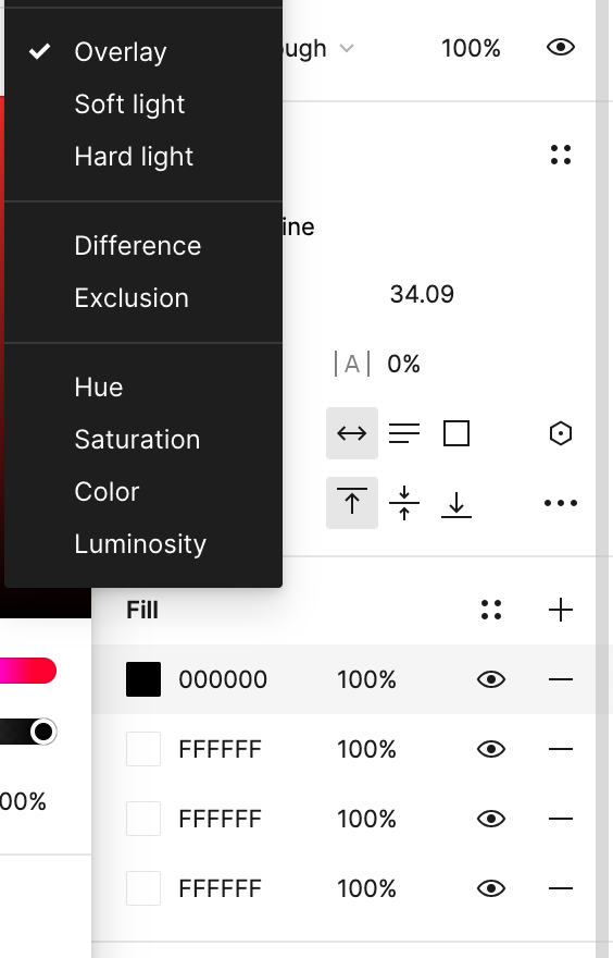
Overlay: Multiplies or screens the colors, depending on the base color. Patterns or colors overlay the existing pixels while preserving the highlights and shadows of the base color. The base color is not replaced, but mixed with the blend color to reflect the lightness or darkness of the original color.
By overlaying white, the text will show up lighter than the base color, and by overlaying black, the text will show up darker. By combining the two, the text shows up lighter on lighter colors and darker on darker colors.

Voilá! The text will, in most cases, auto adjust to white or black depending on its background.
The file I found had additional fills that I don't think were needed, as they worked pretty similarly. If there's a reason for the layers that I left out, please let me know!
I'd like to take this moment to disclose that I have color blindness. Just a lil fun fact.
