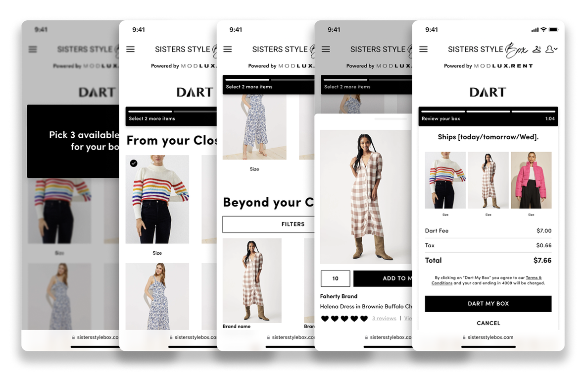
Overview
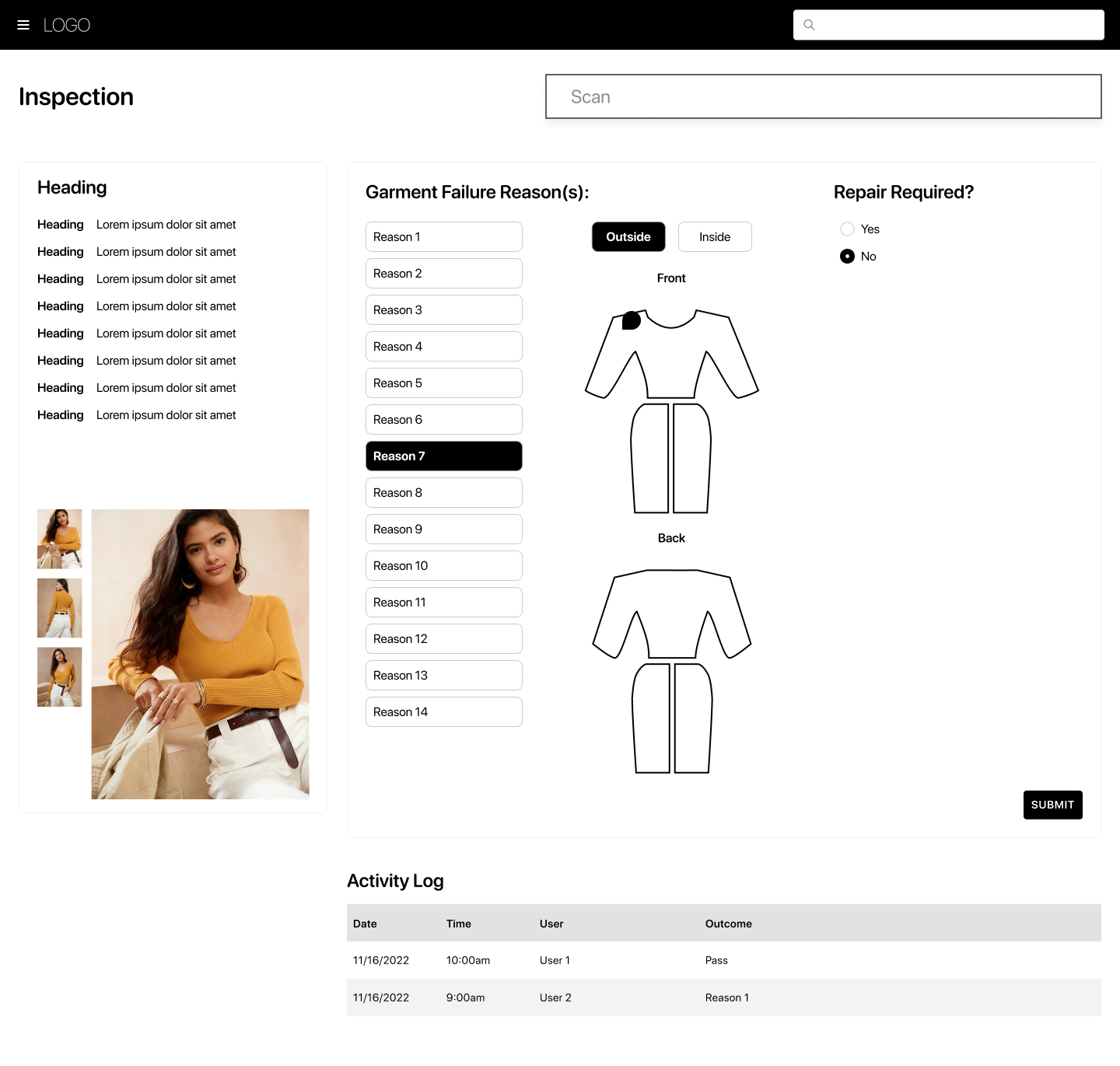
I co-led the design of CaaStle's Digital Action Tag, an internal tool that replaced the paper-based process distribution center team members used to log garment repairs during inspection. Working alongside Ana Hernandez, a PM, and engineering, we redesigned the existing inspection tool and built a brand new repair tool from scratch. The result was a meaningful reduction in friction on the floor, increased throughput in both departments, and, for the first time, the ability for leadership to systematically track repair trends.
Problem
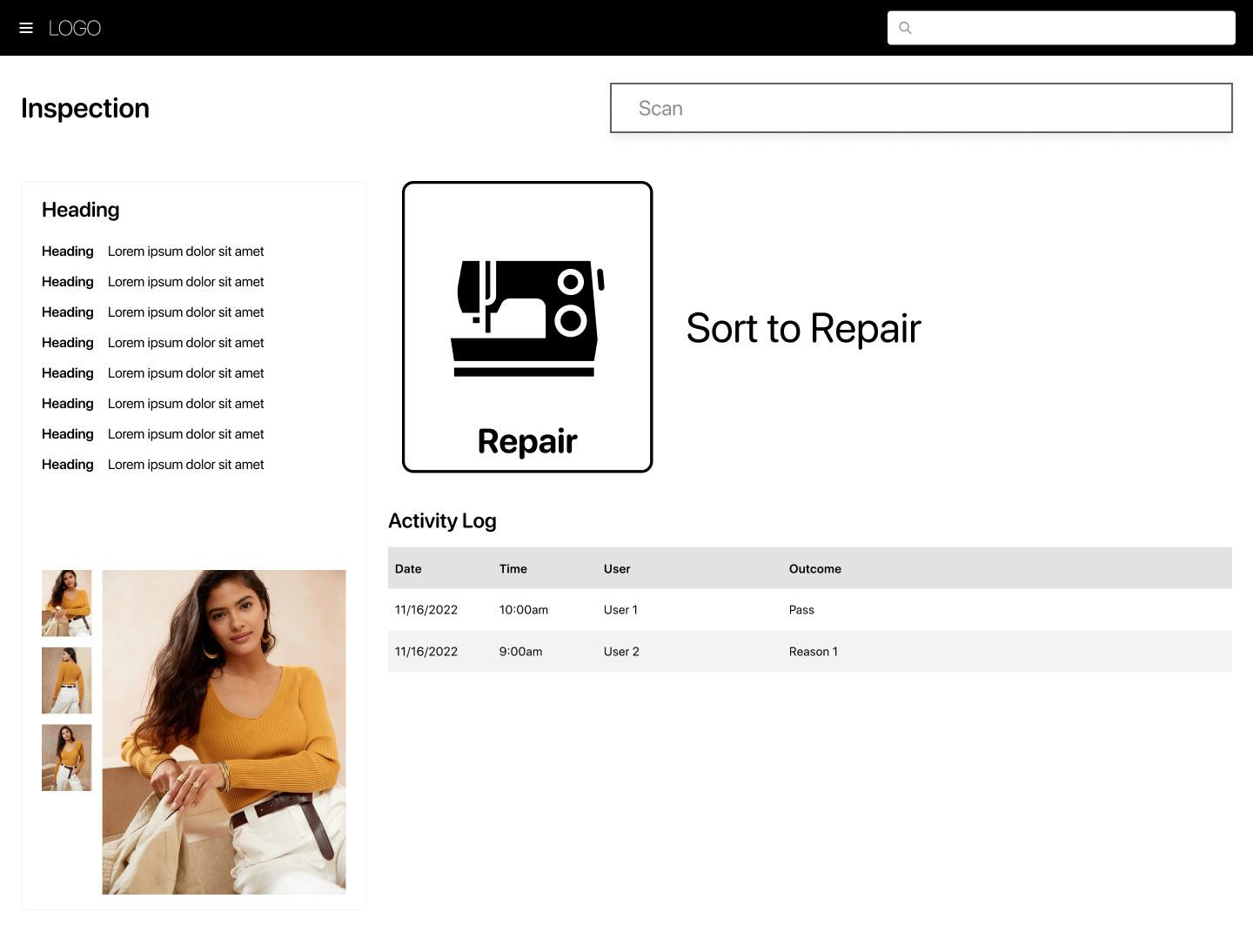
Every garment returned by a rental subscriber passes through CaaStle's distribution center for inspection. When a team member spotted a repair need, the process was entirely manual: handwrite an action tag on paper, place a physical sticker on the garment to mark where the repair was needed, then mentally determine which station it should be sorted to next.
It was slow, error-prone, and impossible to analyze. There was no way to know whether certain garments were failing in the same places, or whether certain repair types were spiking because none of it was being captured digitally.
Our challenge: design an internal tool that fit seamlessly into the physical reality of the distribution center floor while eliminating the paper entirely.
Project Role
- Co-led UX and UI design alongside Ana Hernandez, from user stories through final specs
- Helped advocate for and plan the design team's in-person visit to the distribution center in Arizona
- Developed the UI language for sorting actions, used across multiple internal tools
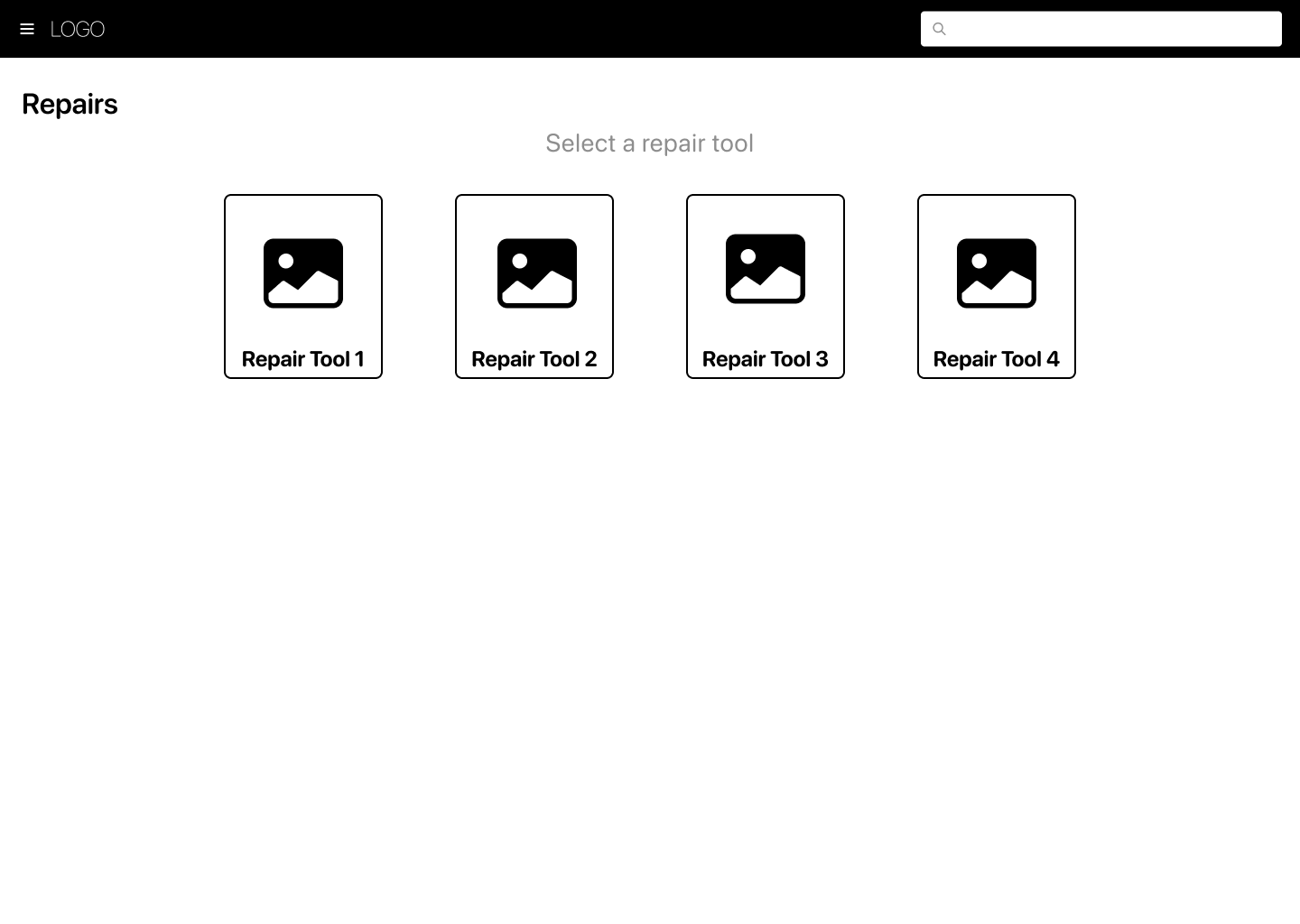
- Designed the digital replacement for the physical sticker system: a tappable garment graphic for logging failure locations
Process
Designing Without Ever Having Been There
The biggest early constraint was that our design team had never set foot in the distribution center. Everything we knew about the physical workflow came secondhand — through product managers and stakeholder descriptions. We were designing for a context we hadn't experienced.
That meant asking a lot of granular questions upfront: How does a team member hold a garment scanner? What size are the screens? How do users physically move garments between stations? We used the answers to define our user flow and make sure the tool made sense in a physical space, not just on a screen.
Building on the Internal Design System
We were in the middle of a broader effort to redesign CaaStle's internal tools, so we started by pulling existing patterns from our design system (navigation, garment scanning, information display) rather than starting from zero. The approach was to use the new UI language on new features until there was enough buy-in to overhaul the legacy UI across the board.
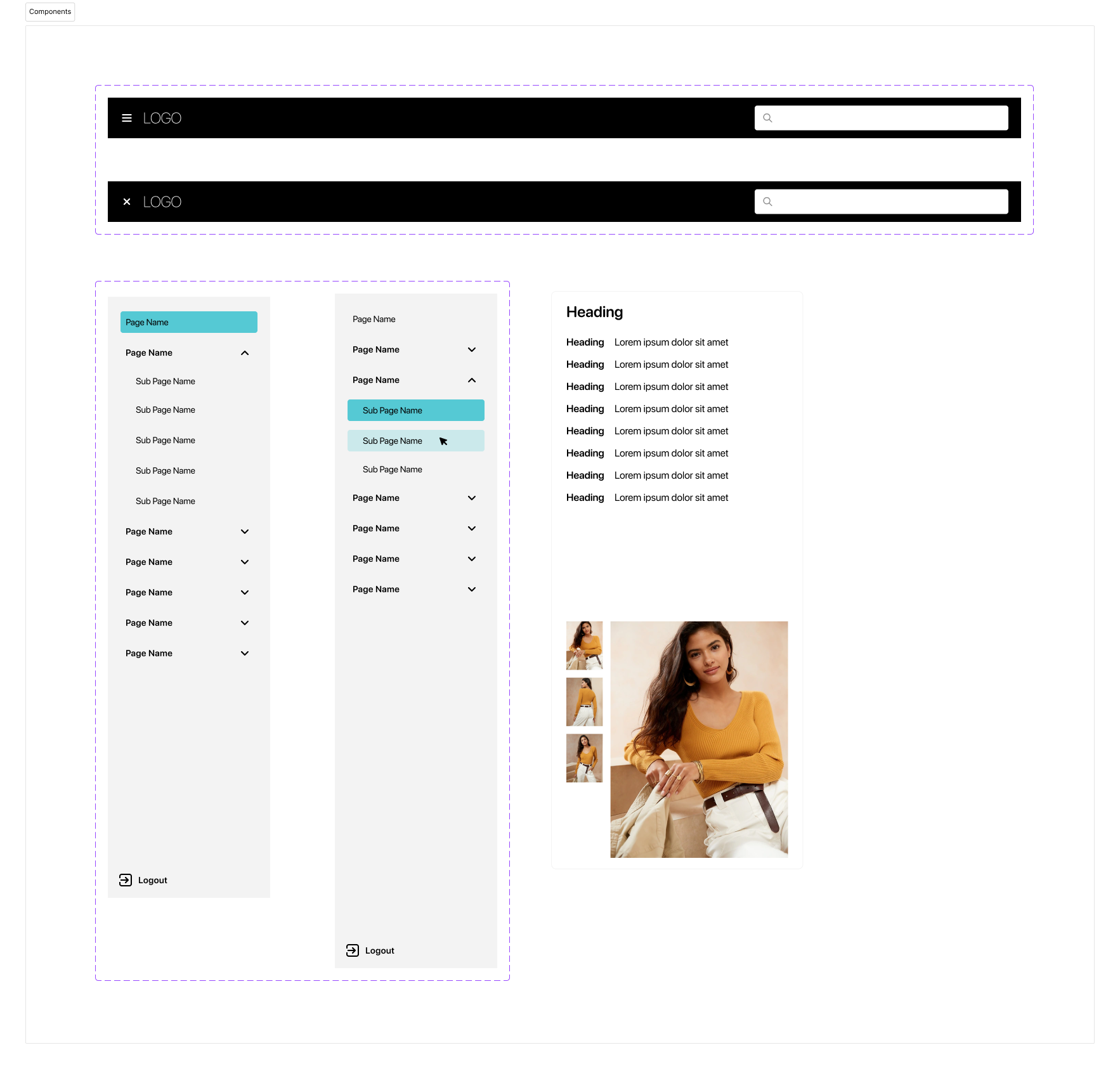
A UI Language for Sorting
Sorting is a common action across multiple distribution center tools, and it needed to be instantly recognizable, especially for team members doing it repetitively. We landed on large bold text, a bold border, and iconography so users could pattern-match to the physical action of moving clothing without having to read instructions.
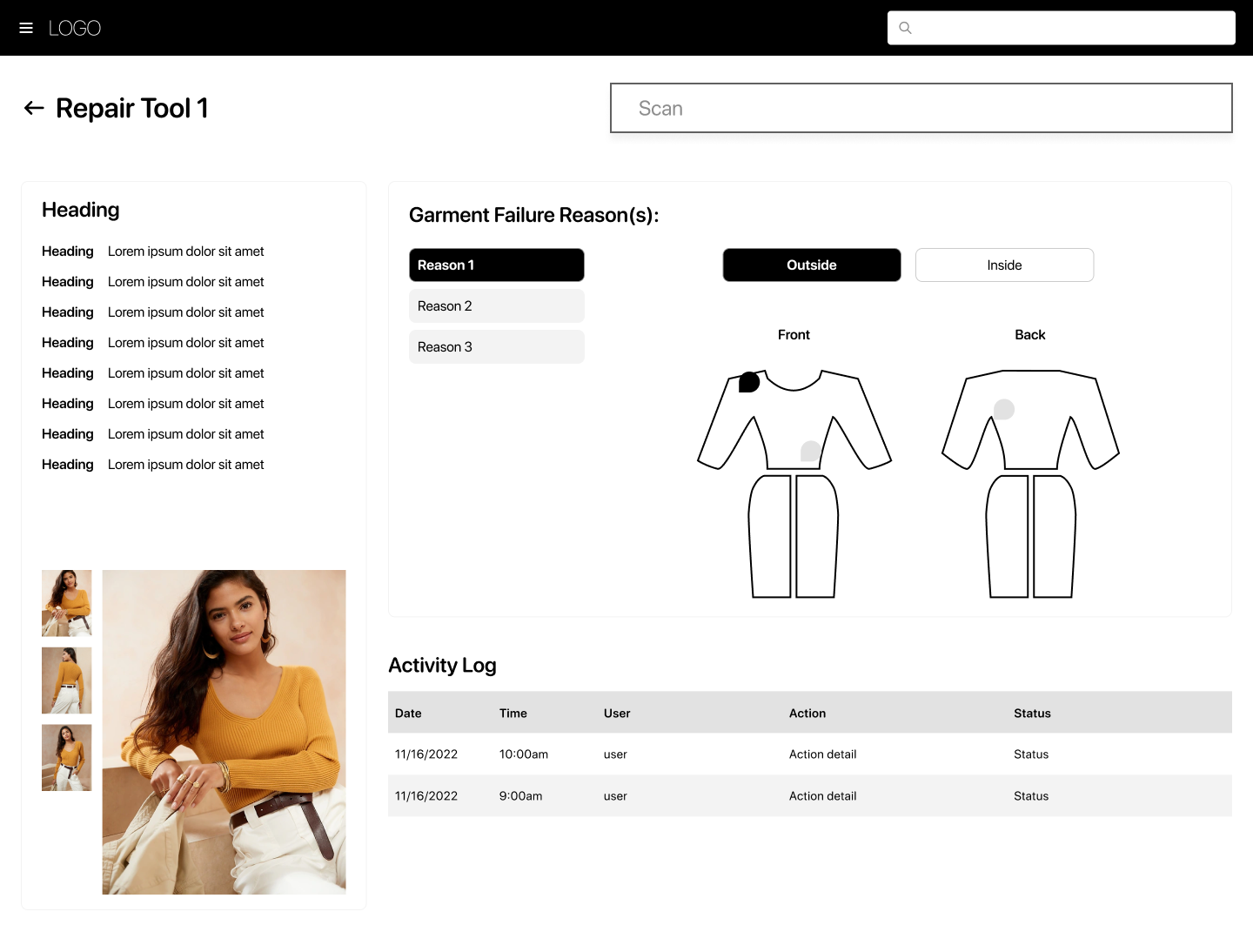
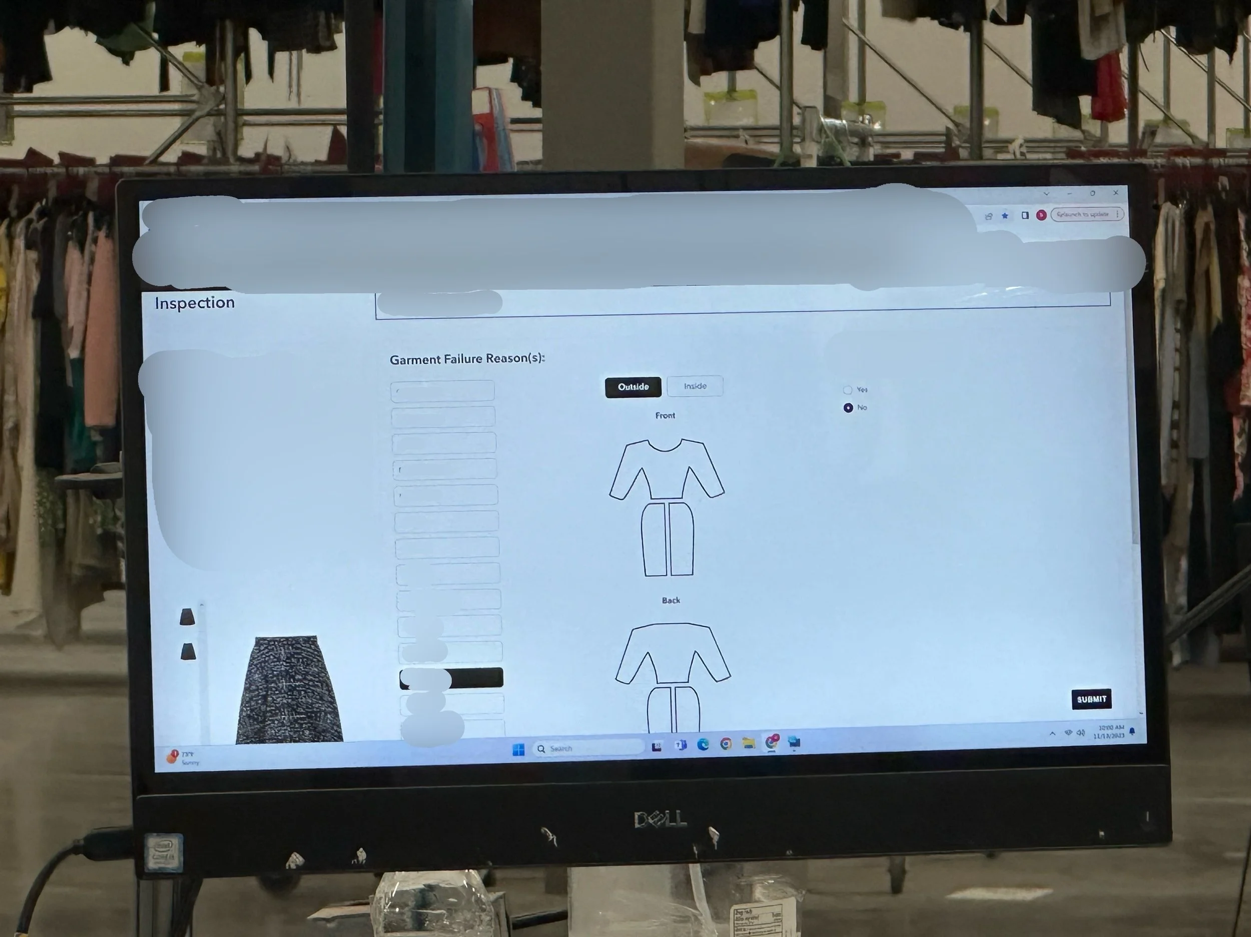
Replacing the Sticker
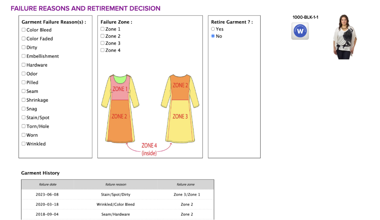
Digitizing the failure location was one of the trickier design problems. The paper process involved placing a physical sticker on the garment where the repair was needed: intuitive, tactile, and specific. Translating that into a touchscreen required both a visual representation of the garment and an interaction that felt equally direct.
We explored garment-specific graphics (pants for pants, shirt for shirt) but learned that was out of scope for engineering. So we designed a universal garment graphic and took inspiration from Figma's comment-pinning interaction: tap the graphic, select the location. It was a familiar pattern that made an unfamiliar tool feel immediately approachable.
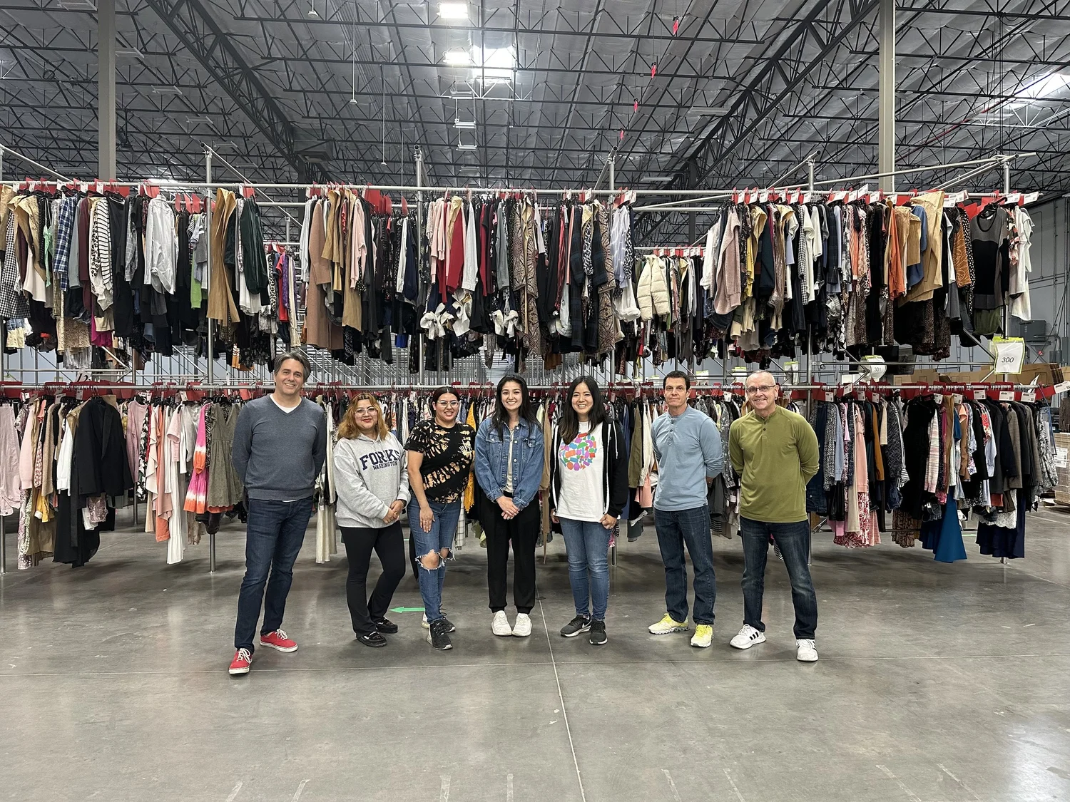
Going to Arizona
Seeing the floor in person surfaced things no amount of secondhand description could have caught:
- Team members wear latex gloves and move between touching garments and tapping screens constantly. Small radio buttons and scrollable forms aren't going to cut it. Large touch targets and above-the-fold submit buttons matter enormously here.
- Users memorize the UX. Repetitive tasks become muscle memory fast, which means designing for efficiency and consistency is more important than designing for discoverability.
Turnover is high. Stakeholders flagged that new employees cycle through regularly, which means the tool needs to be self-explanatory. Instructional affordances aren't nice-to-have, they're part of the design.
Outcome
Distribution center leadership reported increased throughput in both inspection and repair stations after the tool launched. Team members noted the relief of not having to write out paper action tags anymore and, compared to the legacy tool, called the new experience a noticeably better one.
Leadership also gained something they didn't have before: the ability to systematically capture repair data and start identifying trends across their garment inventory.
Reflection
This project reinforced something I think about a lot: you cannot fully design for a context you've never been in. We did our best with secondhand information, and the first version of the tool was solid, but visiting the distribution center in person revealed design opportunities we simply couldn't have seen from a conference room in another state. The latex gloves alone changed how I think about touch target sizing for internal tools.
Going forward, I'd push to include a site visit earlier in the process, before the first design is finalized, not just after launch.