Turning a self-service tool that nobody could use into one they didn't need help with.
Overview
I led the redesign of CaaStle's branded affiliate asset collection tool — the self-service flow that allowed brand and affiliate partners to upload their own imagery to power a turnkey, plug-and-play branded experience. The original tool was so confusing that users regularly abandoned it entirely or needed hand-holding from an account manager just to get through it. After several iterations — including a few honest-to-goodness bandaid fixes — I landed on a dynamic asset preview experience that let users see their page come to life as they built it.
Problem
CaaStle's branded affiliate program offered partners a turnkey service: provide your assets, and we'll build out a co-branded experience for you. The tool to collect those assets was supposed to be self-service. In practice, it was anything but.
Users would get deep into the multi-step upload flow and have no idea where their images were going or what the final page would look like. They couldn't see a preview until the very end — and if something looked off, getting back to fix a single image meant pressing back, back, back, back through every preceding step, then forward, forward, forward just to preview again. More often than not, users gave up entirely or got on the phone with an account manager to be walked through it.
Our challenge: design a self-service experience that brand partners could actually complete on their own, without a support call.
Project Role
- Led UX and UI design end-to-end, from problem definition through final prototype
- Drove alignment with engineers across multiple iterations to establish feasibility
- Produced an interactive Figma prototype that served as both a usability testing tool and an engineering implementation reference
Process
The Bandaid Era
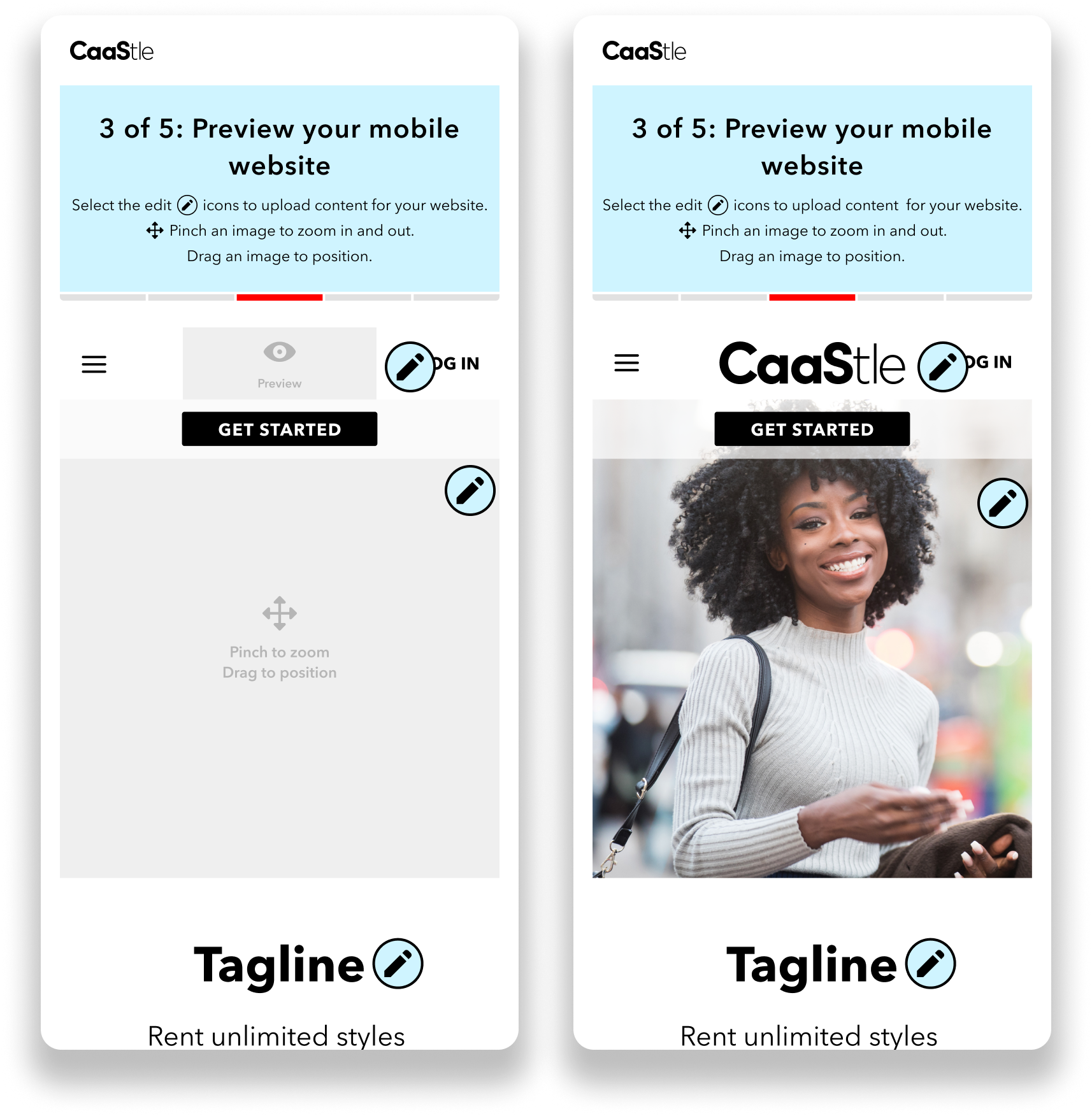
For a while, the team's instinct was to patch the existing flow rather than rethink it. Looking back, even the first "fix" — adding a preview step at the end of the process — was already a bandaid. The v1 of this tool had no preview at all. Users were uploading images into a black box and hoping for the best.
The fixes that followed tried to make the existing structure more tolerable rather than addressing why it was broken:
- Bandaid #1: Added a preview at the end of the upload flow so users could at least see the result before submitting.
- Bandaid #2: Made individual images clickable from the preview screen — but still required users to navigate back through every subsequent step to return to it. We even added instructional copy explaining this. (Yes, really.)
- Bandaid #3: Introduced a skeleton screen at the start of the flow to act as navigation between upload steps. It was, in hindsight, just a worse version of where we were eventually headed.
Each fix was accepted. Each one made things marginally less bad. But none of them solved the actual problem.
The Real Design Question
How do we stop patching a broken flow and design one where confusion isn't possible in the first place?
The answer was already emerging in the skeleton screen iteration. Users needed to see the page they were building — not at the end, not after clicking through steps, but while they were building it.
Getting Engineering On Board
The biggest obstacle to the real solution wasn't conceiving it — it was convincing engineers it was feasible. The concern was that a dynamic preview experience would require overhauling everything they'd already built.
What changed their minds was the incremental nature of the bandaid fixes themselves. Each iteration pushed the experience a little closer to the dynamic preview without framing it as a full overhaul. By the time we proposed the actual solution, engineers had already accepted each individual step along the way — and could see that the final vision wasn't as far a leap as they'd feared.
Design Solution
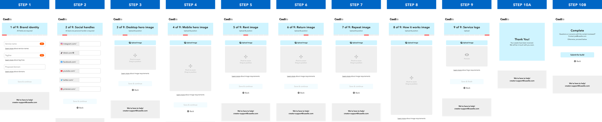
The final experience was a dynamic asset preview: a mocked-down view of the branded page, presented upfront. Partners could see exactly where each image would live. They'd click directly into a section, upload their asset, and watch that section of the page fill in with their own content in real time. No steps to navigate. No mystery about where things were going. No back back back back.
The approach was intuitive to the content creators using it — the interaction pattern was familiar, the feedback was immediate, and the result was visible throughout the entire process rather than only at the end.
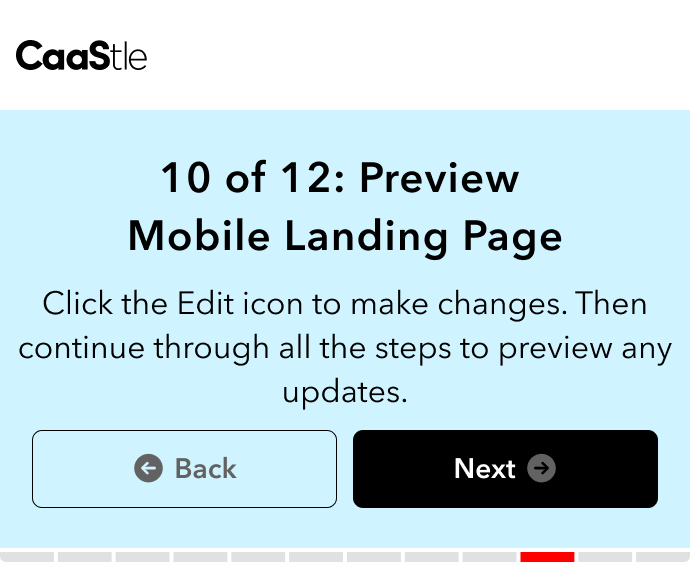
An interactive Figma prototype was central to the process on two fronts: it was used directly in usability testing to validate the experience with real users, and it served as the implementation reference for engineering, reducing ambiguity during build.
Reflection
This project is a good reminder of how easy it is to spend a lot of effort solving the wrong problem. Every bandaid fix we shipped was real work — and none of it addressed why users were struggling in the first place. The tool wasn't hard to use because of missing instructions or a lacking preview; it was hard to use because it asked users to mentally simulate a result they couldn't see.
The dynamic asset preview worked because it eliminated that gap entirely. What you're building is what you see. That's not a novel concept — it's just one we took too long to let ourselves reach for.