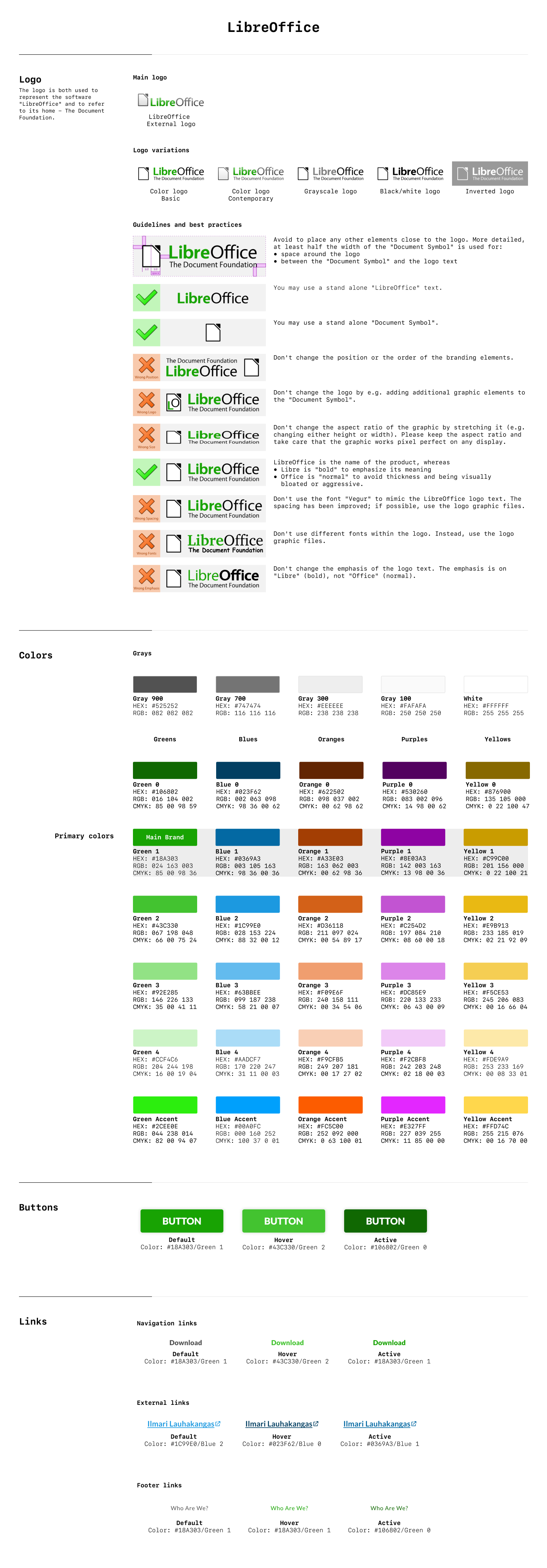
Role: UI/UX Designer

I joined a team of user experience designers and researchers with a goal to redesign LibreOffice's consumer pages while working closely with its stakeholders. We began with the landing page.
User research was previously conducted and found that LibreOffice's target audience consists of both its product users and its community members. Our goal was to find a clear way to showcase both while maintaining cohesiveness. The current landing page is unclear to both groups: what is the product and what does it do? What is the community for? These are the questions that we wanted clearly answered with our new designs.
Team: Dan Gallagher, Irene Geller, Zarema Ross, Helen Tran

My first impressions of the LibreOffice website and my thoughts on how the landing page could be improved are outlined below:
- There is no indication of what the products actually look like. Screenshots/videos of the product in use should be added.
- There's an overwhelming amount of information that doesn't pertain to either product users or community members. This information should be restructured into other pages on the website.
- The stock images used are too vague. If the target audience are product users and community members, the landing page should be more approachable. This could be achieved using illustrations instead.
Validated by the previous research conducted, the three concepts that were to be implemented on the landing page included the following:
- Videos and tutorials
- A chart comparing features to other office suites
- A community map to show its global community members
With these in mind, the team started on sketches, shown below:
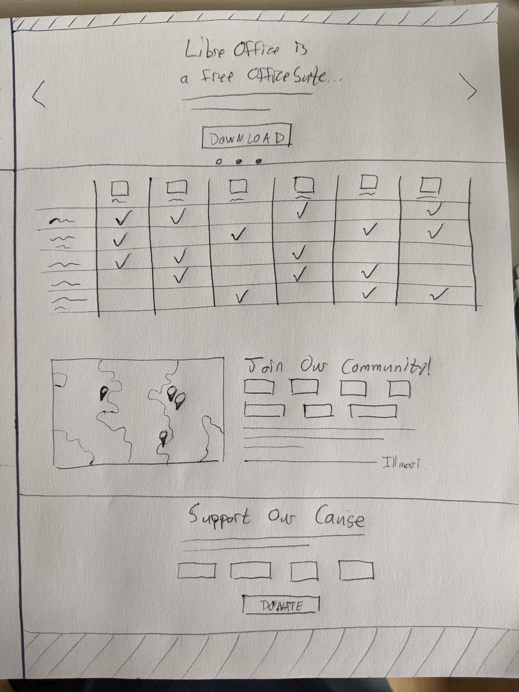
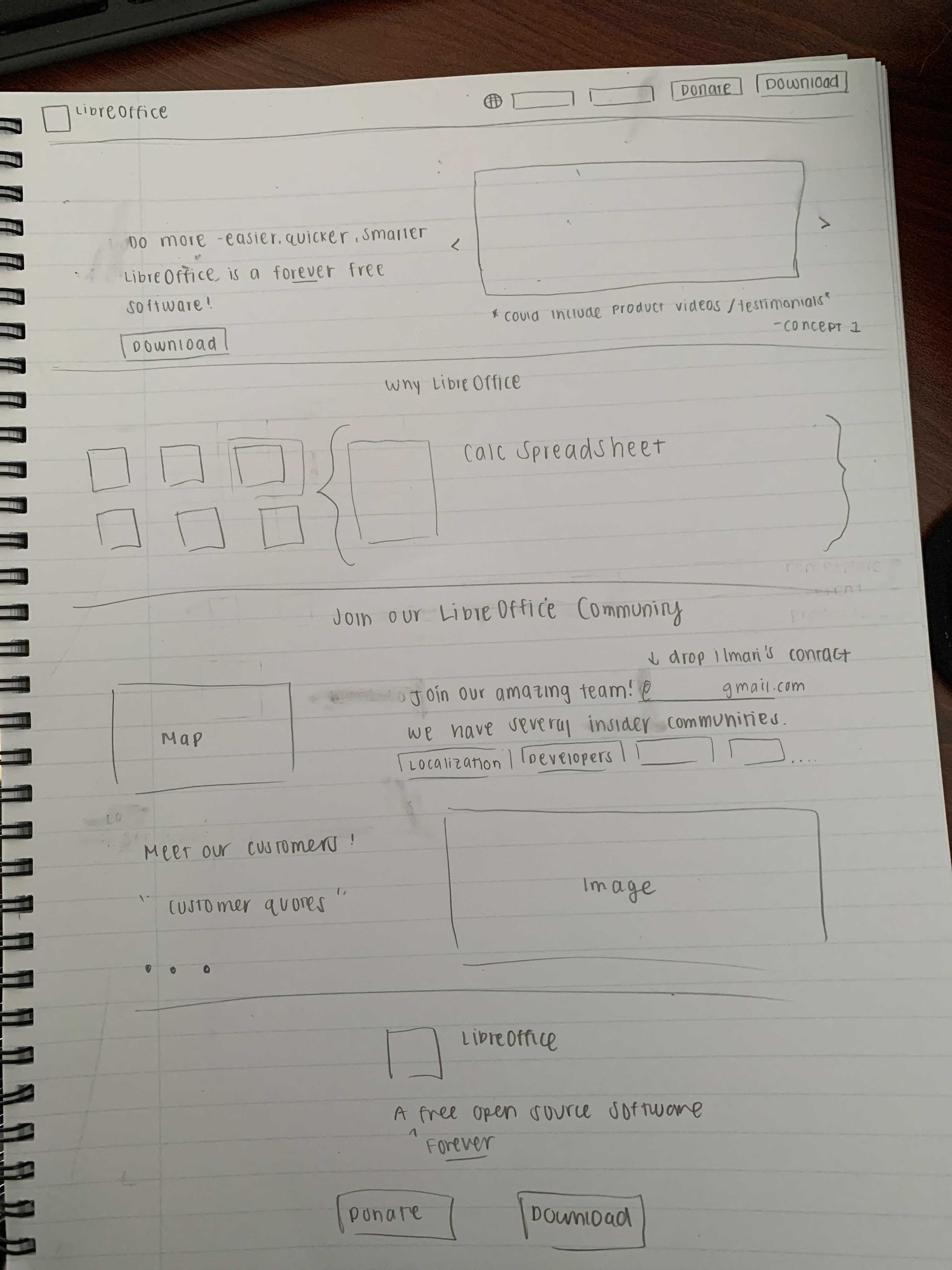
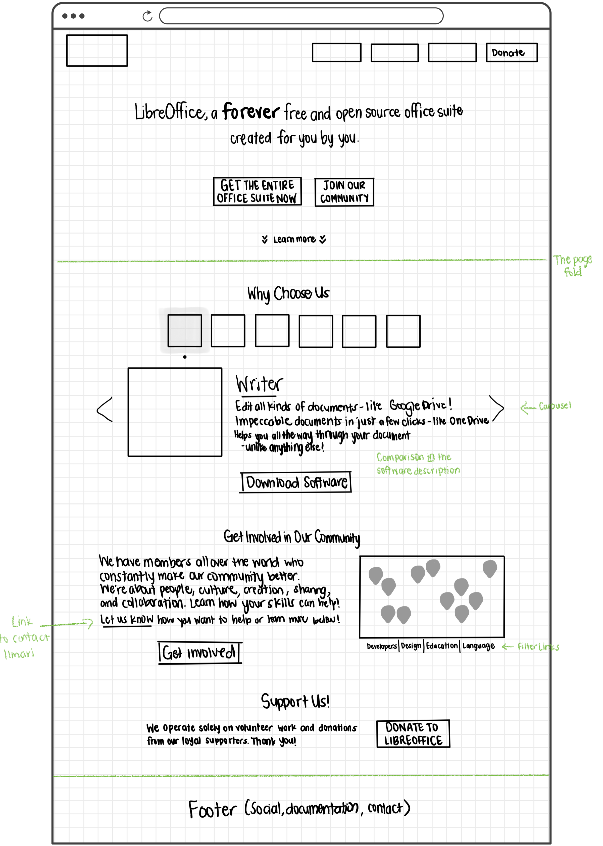
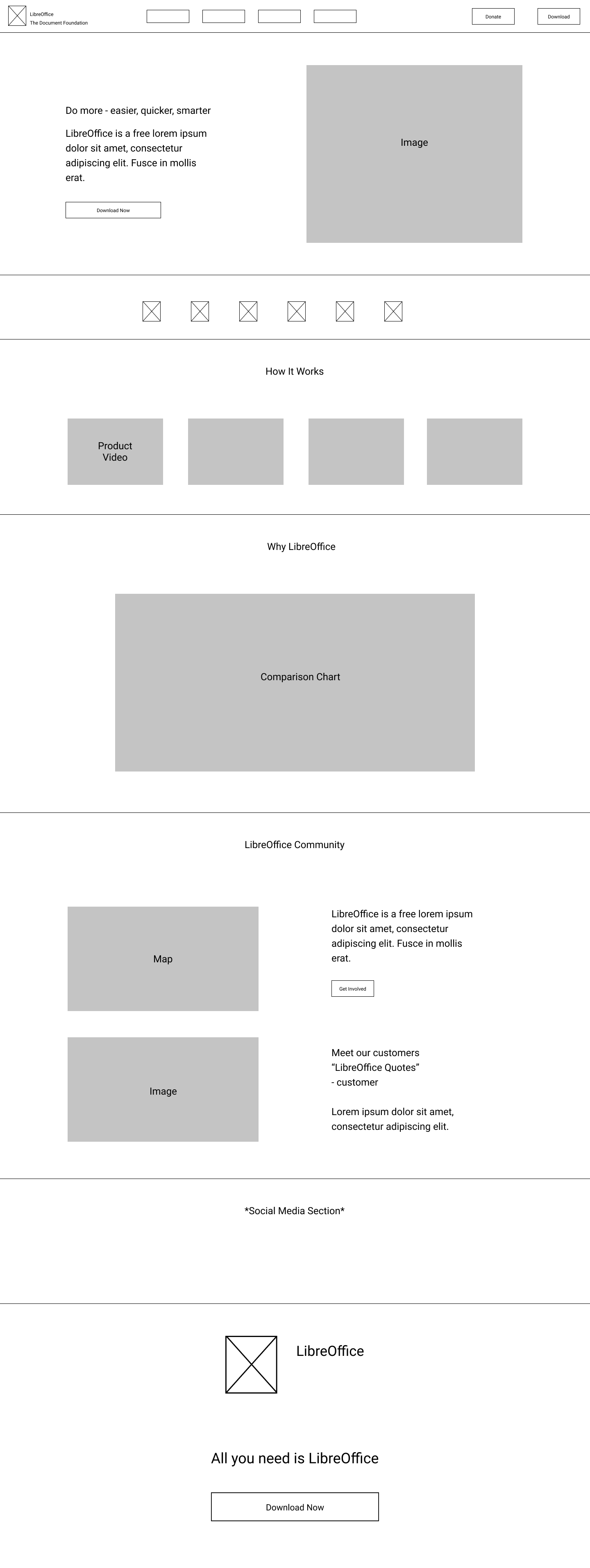
By taking the most appropriate structure and designs of each sketch, we formed our wireframes, mid-fidelity, and hi-fidelity mockups.
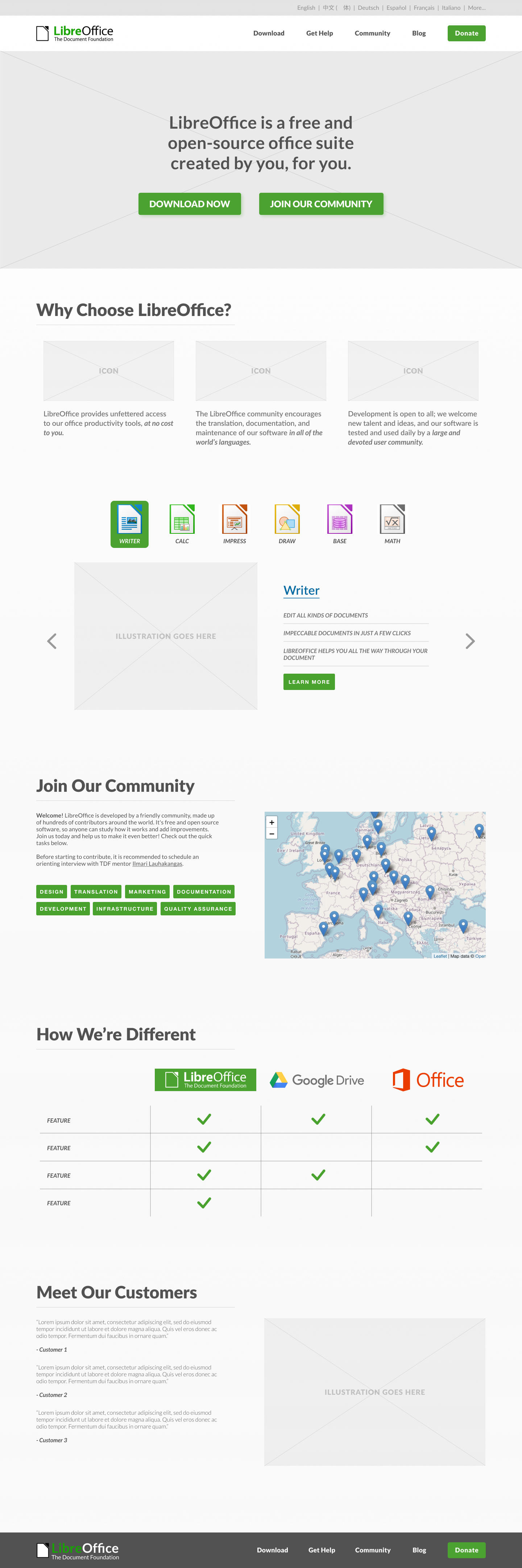
After performing usability tests, the problems that users had with our hi-fi mockups were
- the inability to find the language picker
- the inability to find the link to contact the TDF mentor, and
- the amount of green there was in the hero section, making it difficult to navigate.
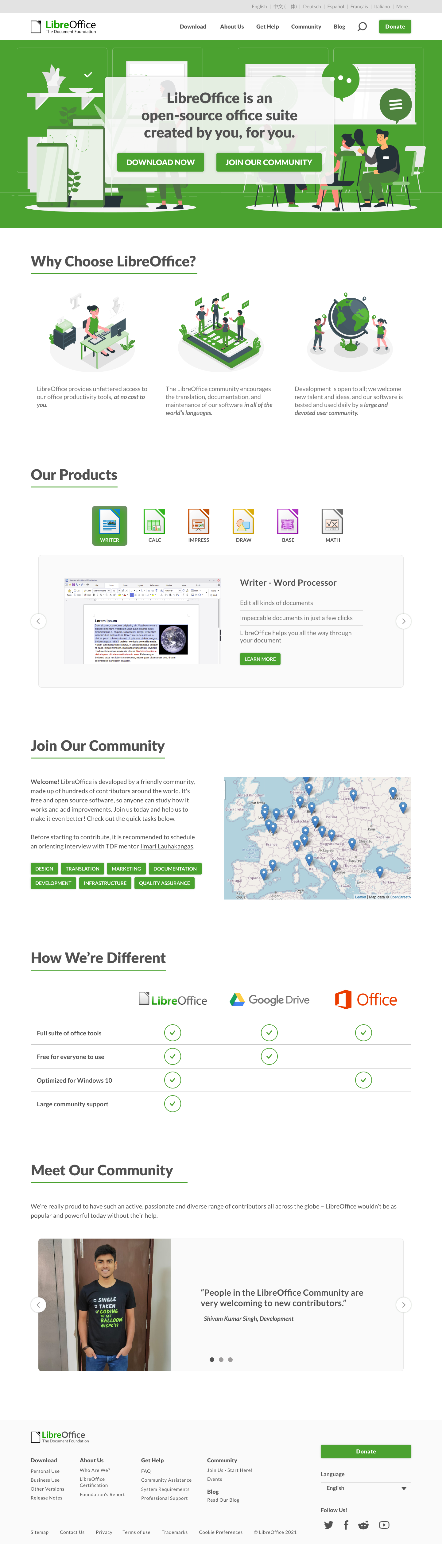
After presenting both the hi-fi mockup as well as these user comments, the stakeholders and our team decided to design the language picker as a dropdown menu. This way, no languages seemed prioritized over another by hiding or excluding parts of the list.
The stakeholders also provided us with their design guidelines which we converted into a style guide. This allowed us to convert links to a more standardized blue and also gave us more colors to contrast the colors in the hero.
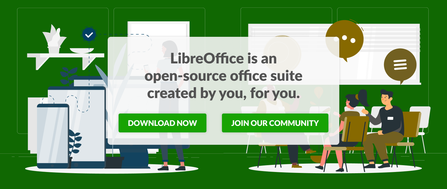
The hero now uses its darkest green in the palette as its background color and its brand green for its calls-to-action. We also separate the target audience using the darkest blue for the products and the darkest yellow for the community - combining the two makes LibreOffice.
The stakeholders and our team agreed that the newly redesigned landing page better addresses its target audience of both product users and community members.
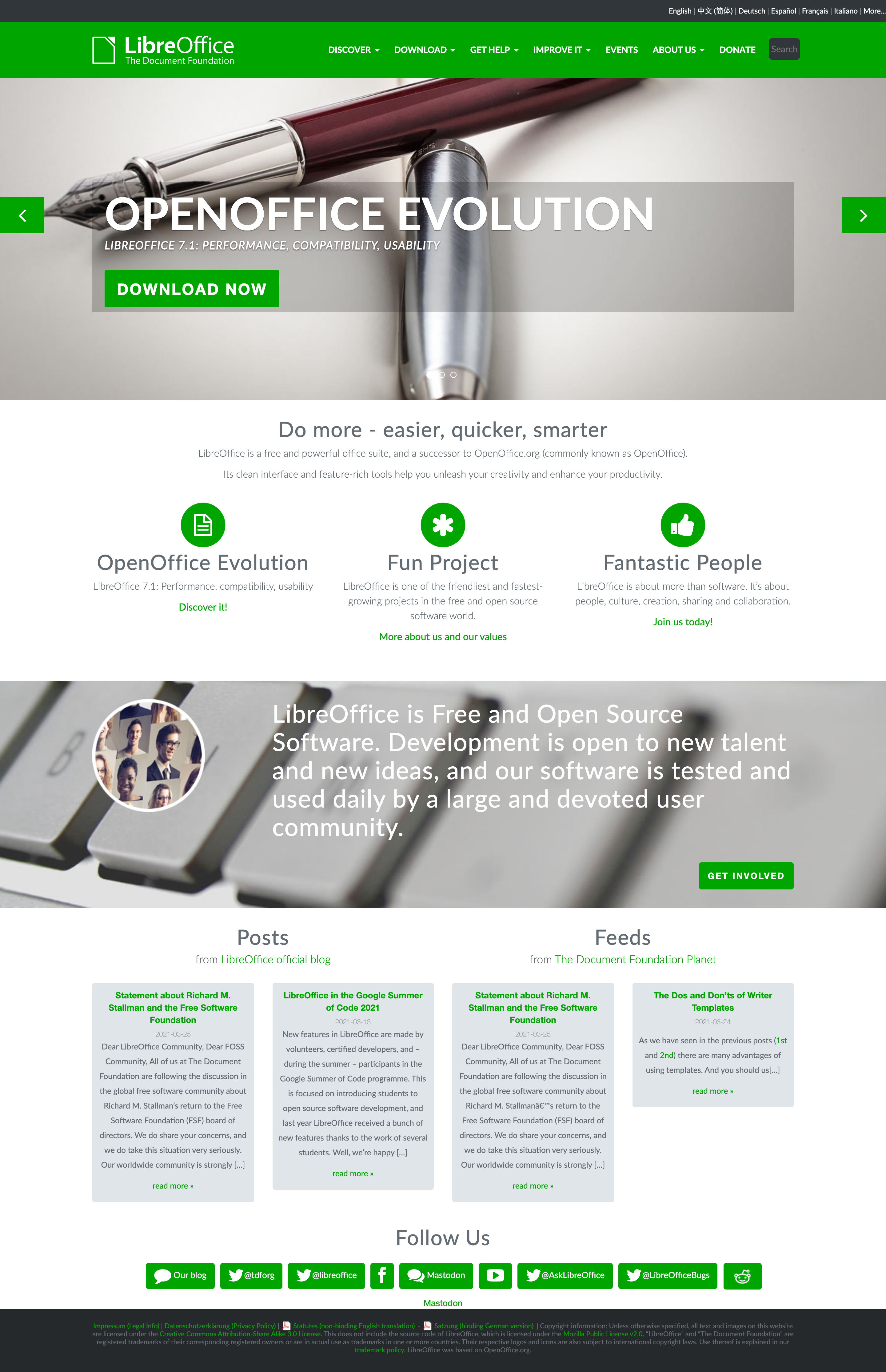
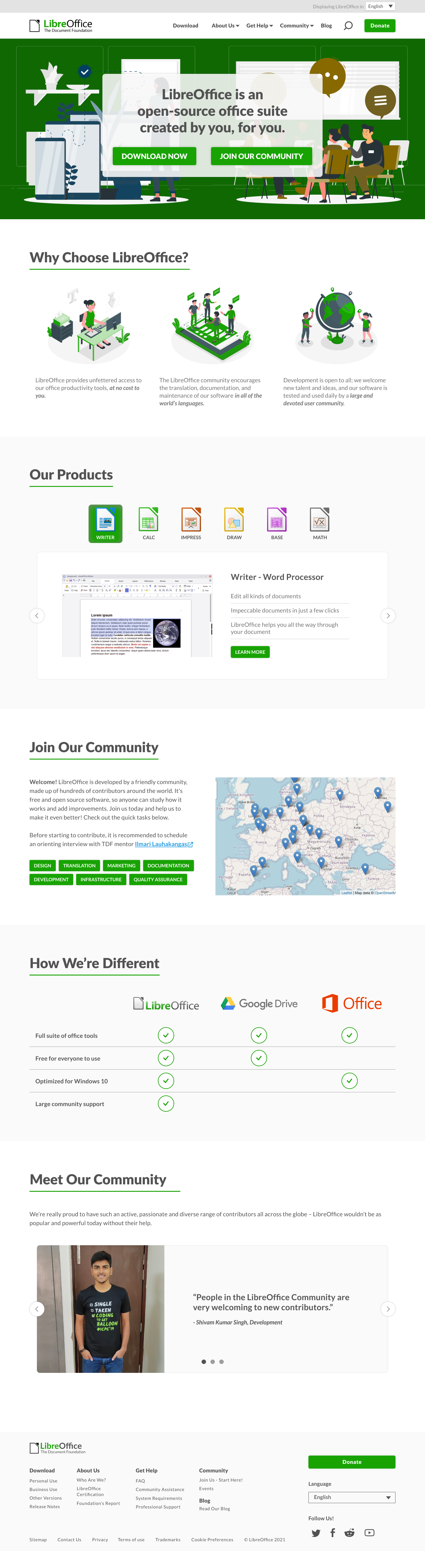
The current landing page and the redesigned landing page
After handing off the annotations and specs to the product developer, we jumped right into working on the redesign of the next customer facing page, the downloads page. The goal for this project was simplicity.
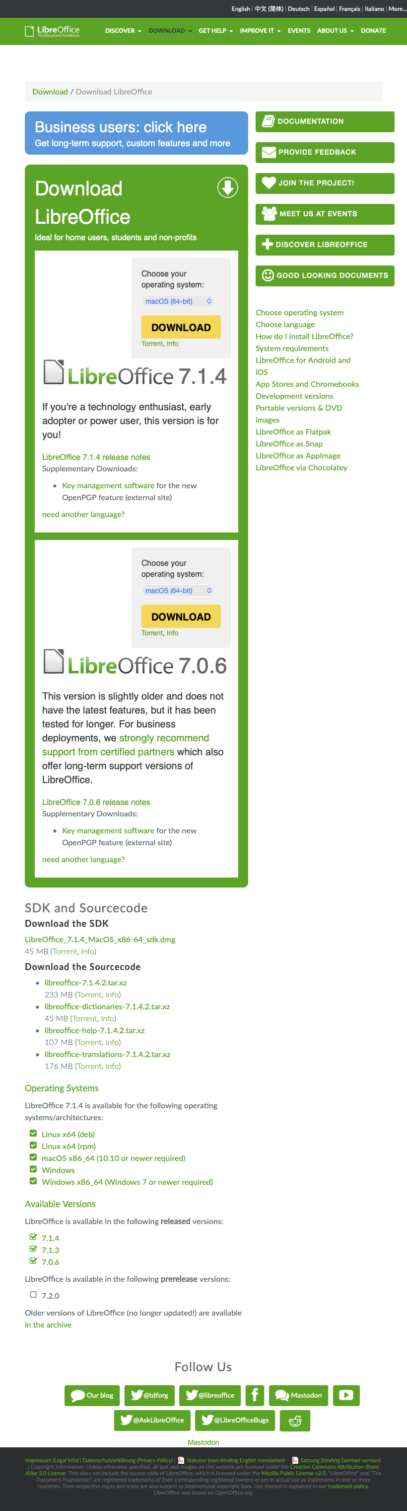
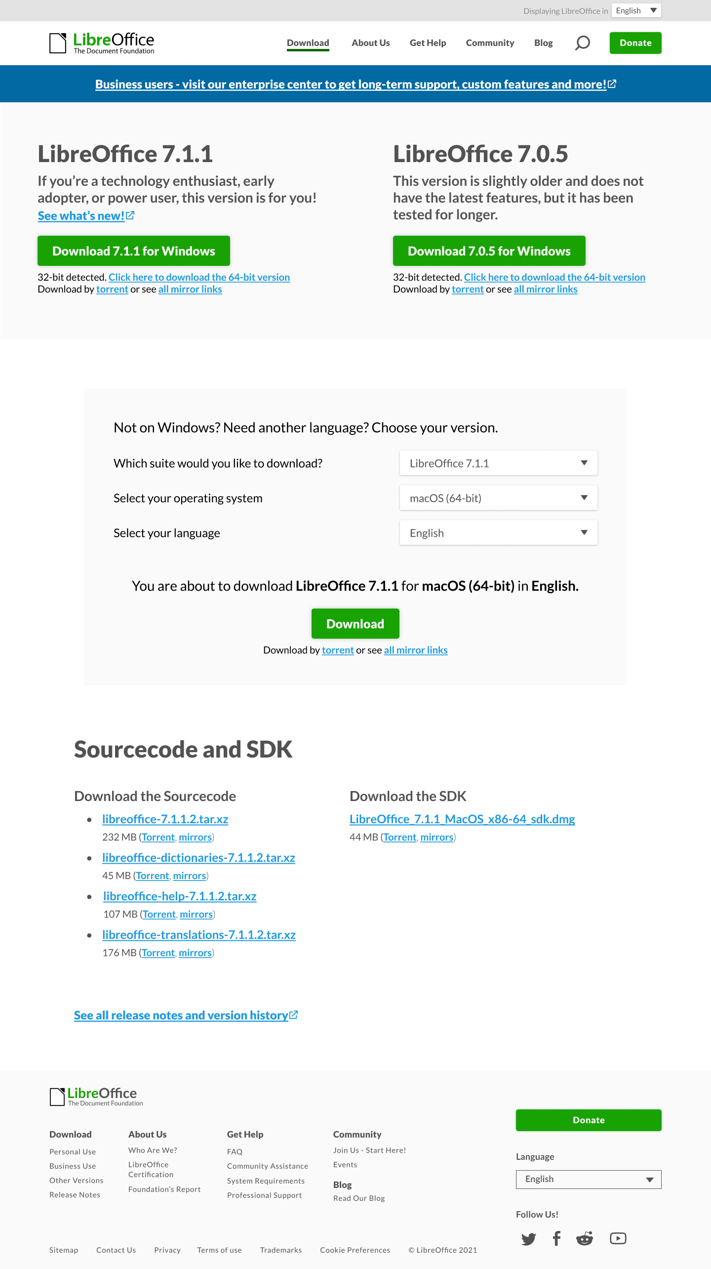
The current downloads page features a two column layout with many buttons that don't address the main event of the page: downloading the software.
LibreOffice not only offers two versions of their software suite but offers them for different processing units as well as for a variety of operating systems. We wanted to design a way for users to efficiently choose the version they want for the OS they use.
In order to achieve simplicity, we wanted to implement the following:
- A one column layout
- Fewer buttons/calls-to-action that don't pertain to the download event
- Less reading for the user
- System auto detection
- Engaging and actionable items (ie choosing their version and operating system)
We began with sketches and information architecture of the page.
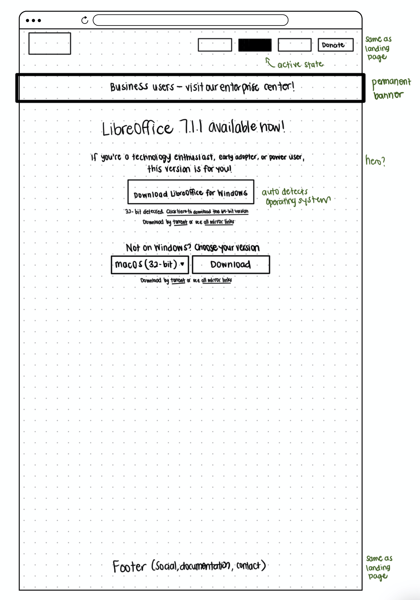
The sketches seen above had evolved after team discussion as well as gathered inspiration from other download pages, such as Firefox, ClickUp, and Slack.
The hierarchy dictated that both versions remain side-by-side in the hero, available to download by auto detection by the browser. If the user wanted to choose a different operating system or language (or if auto detection weren't accurate), she could pick below by specifying her exact options and downloading this way. The final sketch included separation of the hero and option picker sections for further clarity.
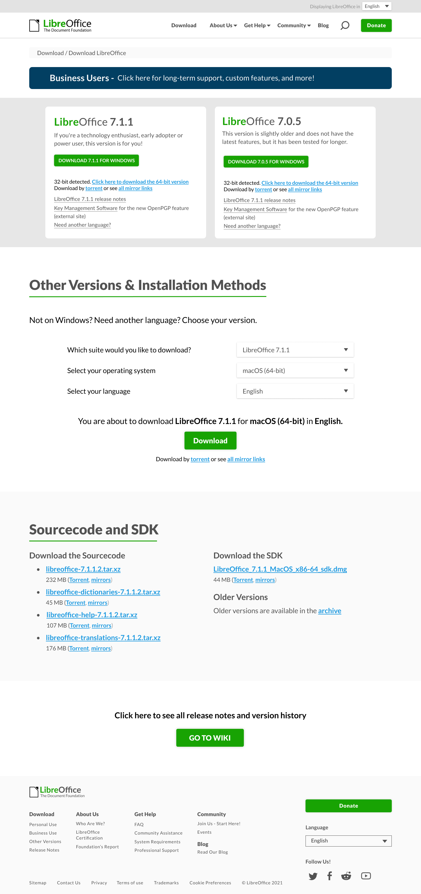
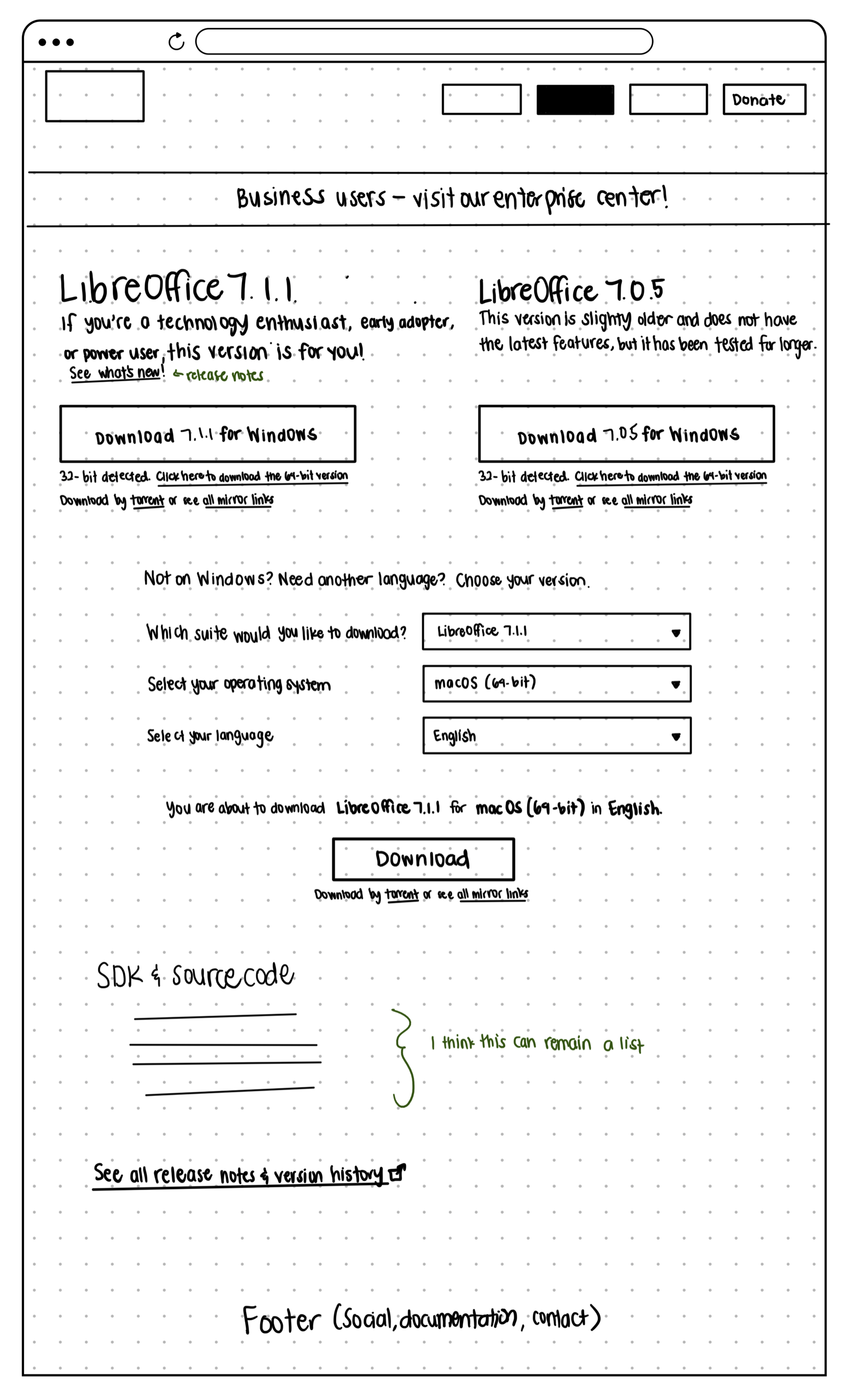
The sketches were implemented into mockups that were then iterated after further discussion:
- The banner to redirect business users became more of a button to indicate a call-to-action
- The two versions were separated into their own containers to distinguish between them
- The different sections were given titles for clearer navigation
- The source code section was given a banner but ultimately removed to direct the user to the wiki to reduce the amount of text on the page
- The button to direct to the wiki became a secondary button instead of primary to distinguish between the prioritized primary download button
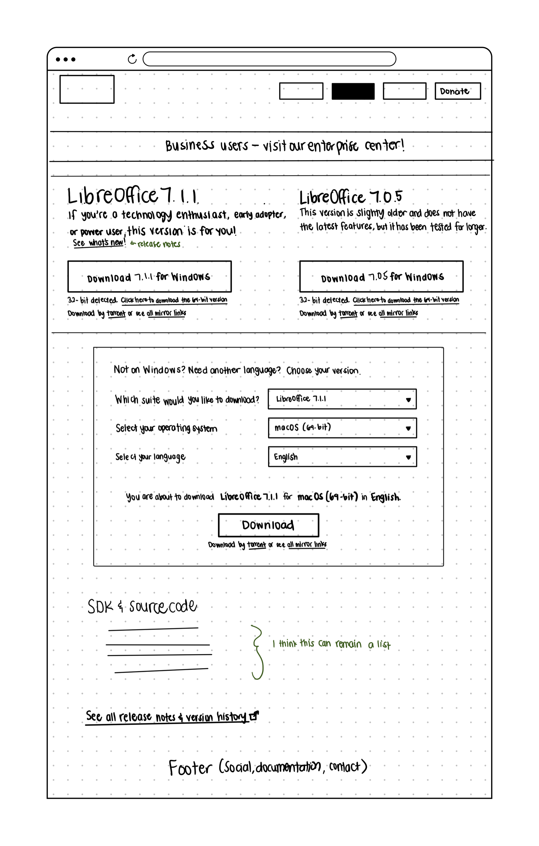
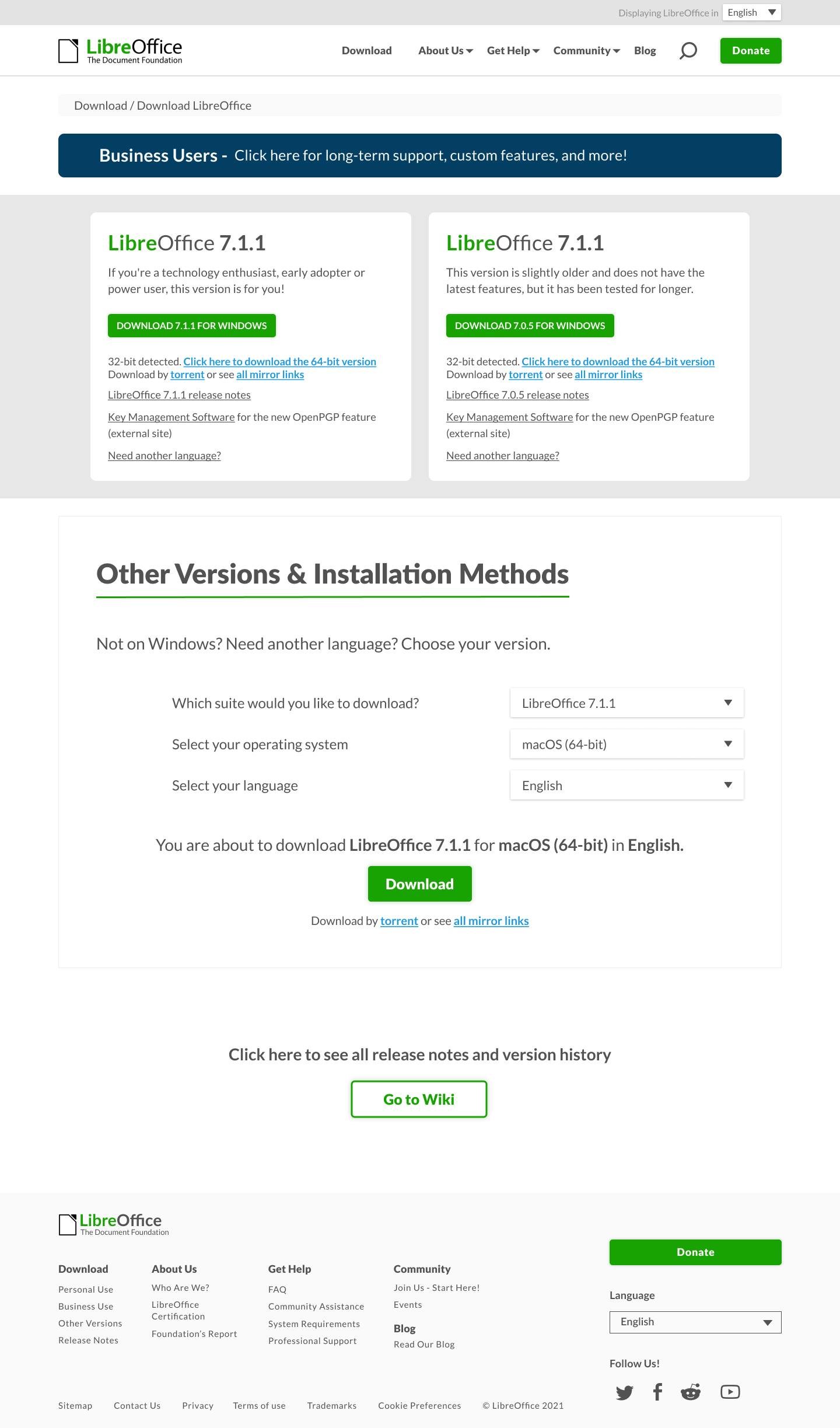
The final iterated version was tested with users who gave us the following feedback:
- A visual incentive to choose one download over another
- The business banner looked more like an ad
- The redirect to the Wiki should be more visible
We addressed these points by:
- Outlining the latest software version in green
- Removing the color from the banner and including the button to redirect to the business page
- Creating a card-like section to redirect to the wiki as well a software management site for a small number of users
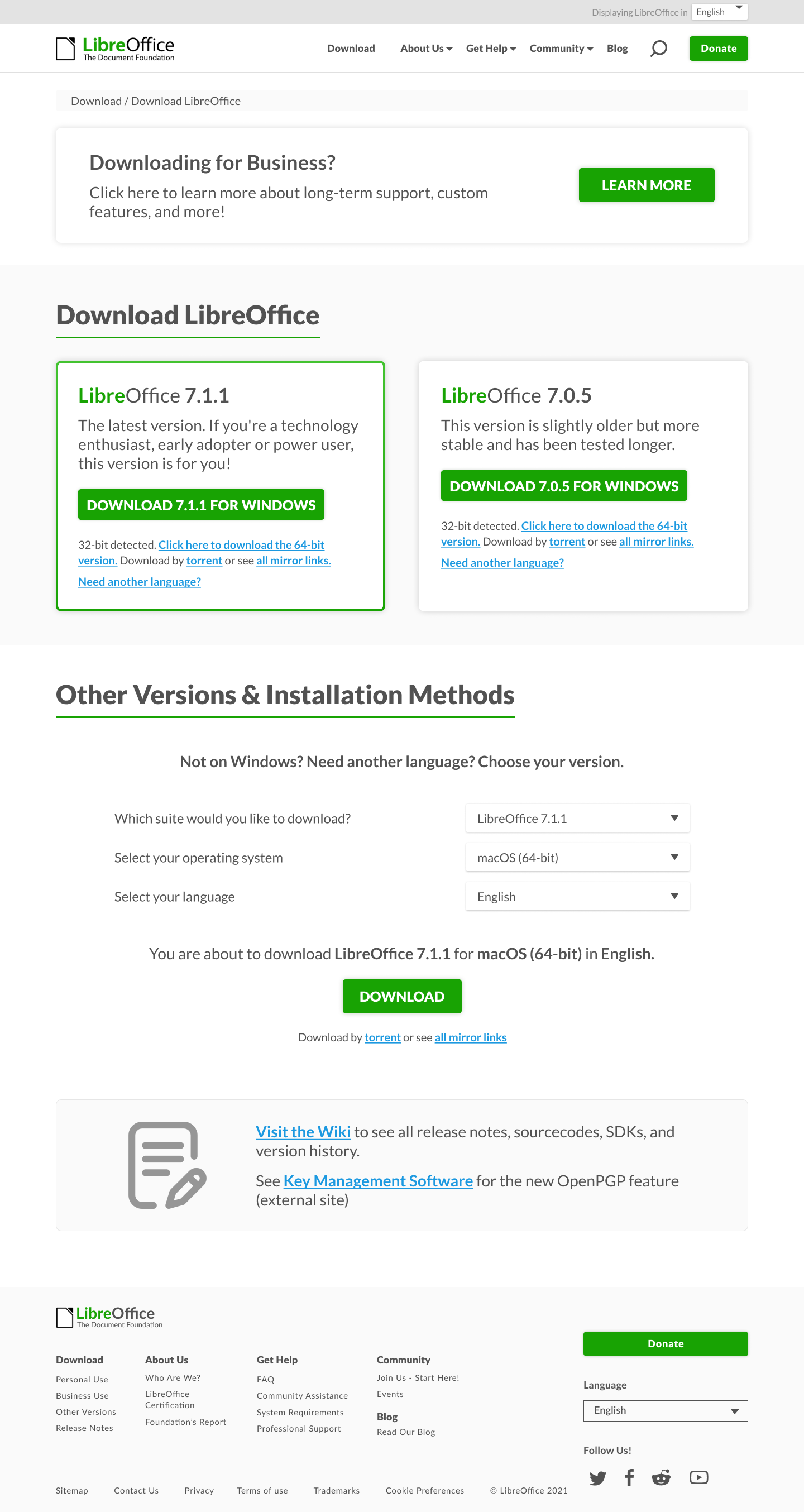
Comparing to the current design page, our team and our stakeholders believe that this is a much simpler download experience for the users.
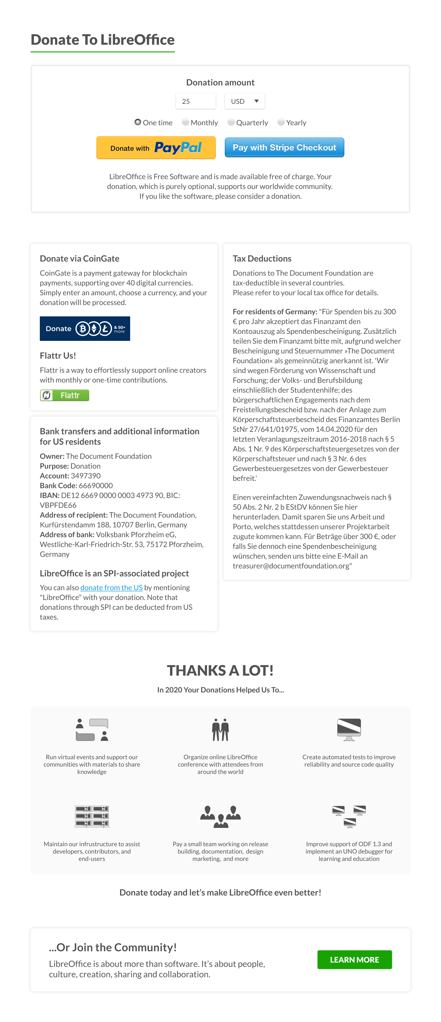
We began our last project, the donation page, which the goal was also simplicity.
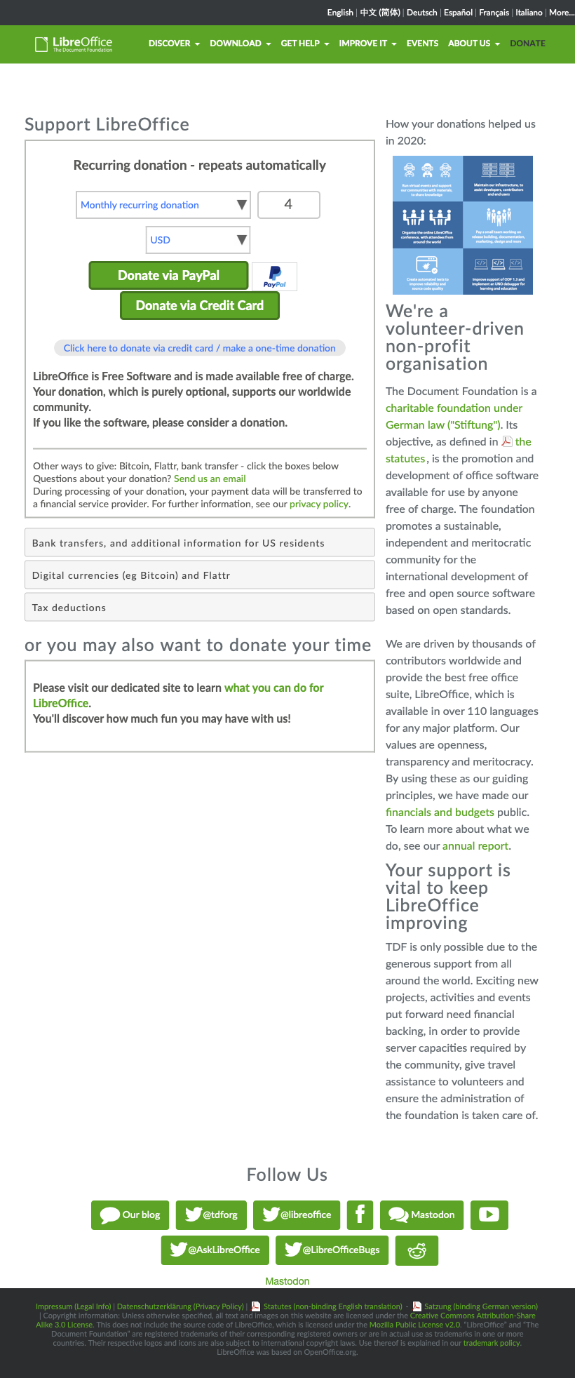
Similarly to the download page, the current donate page features a two column layout that doesn't emphasize the main event of the page - the donation action.
We wanted to achieve what we had done previously with the landing page by designing the donation page to be a single column layout, shown in the iterations below:
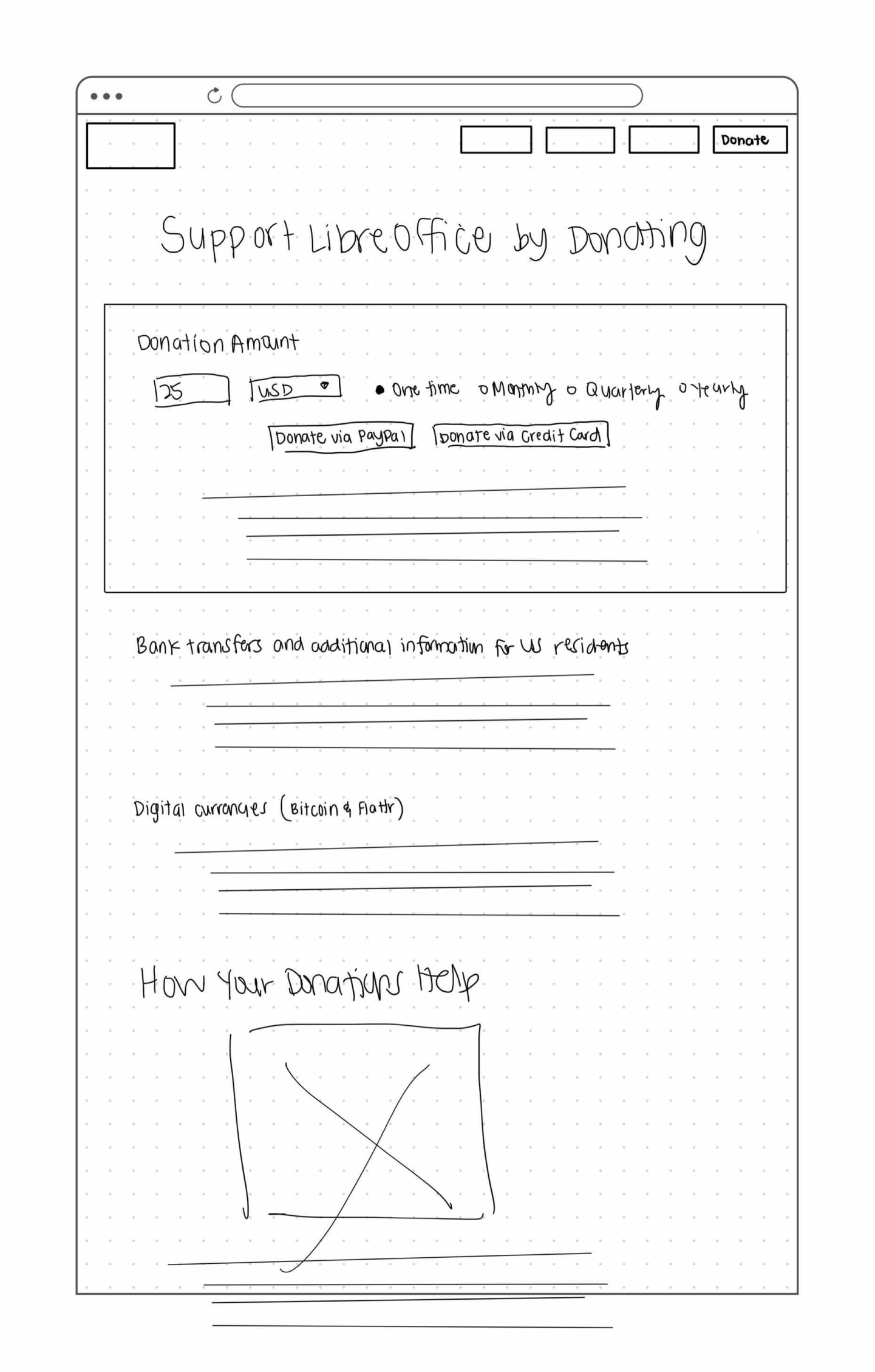
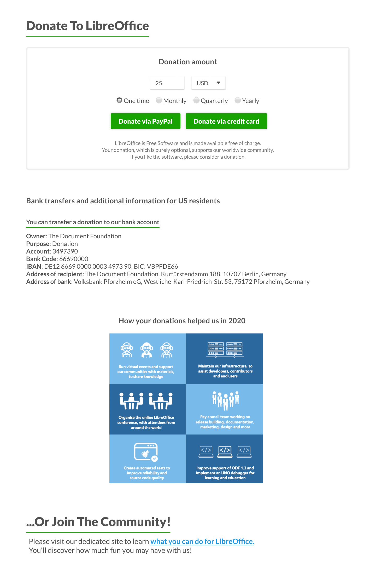
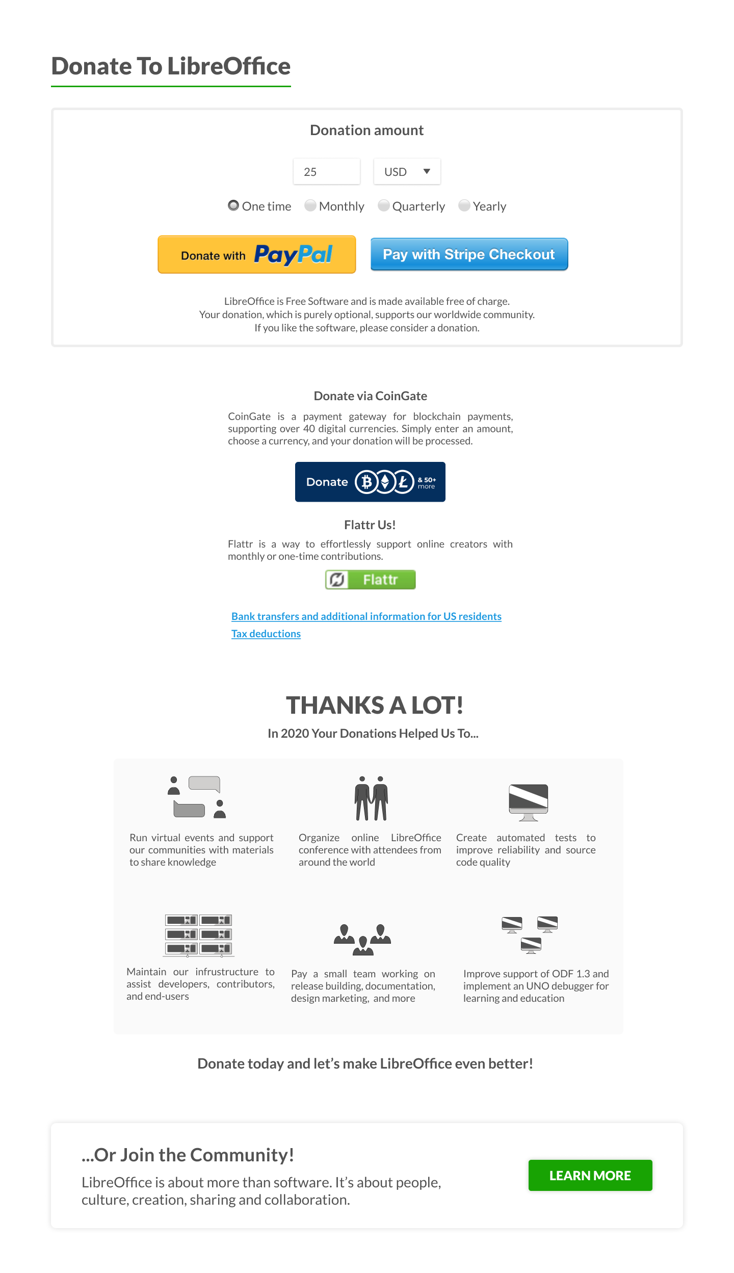
However, we had learned of certain constraints regarding the amount of information that was required to be shown upon loading the page, meaning we could not hide certain elements in accordions or drop downs. I had struggled with the information hierarchy with these constraints because of the amount of text that was required to be shown. I was very fortunate to have my team, as another member navigated the constraints and was able to design a hybrid one-two column layout.
A big thanks to the LibreOffice team for the opportunity to work with them as well as my team - Dan Gallagher, Irene Geller, Zarema Ross, and Helen Tran.