Integrating the purchase and order flows for a more seamless, unified experience.
Overview
I co-led the design of an integrated cart and checkout experience for CaaStle's Borrow button — a feature that lets shoppers rent items directly from partner e-commerce sites. The existing handoff between a partner's storefront and CaaStle's order management system was abrupt and disorienting, a friction point confirmed through both firsthand observation and user testing. Working alongside PMs, engineers, and fellow designers, we redesigned both the carting and checkout flows to feel native to each partner's brand, starting with Altuzarra.
Problem
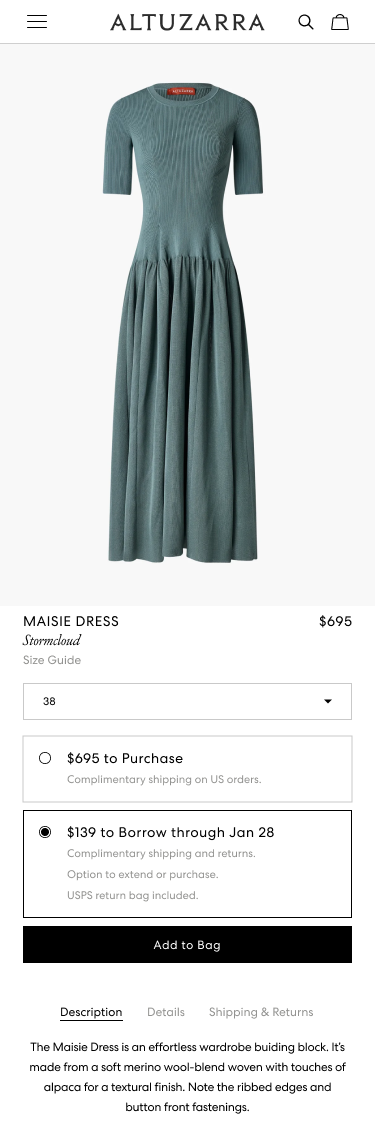
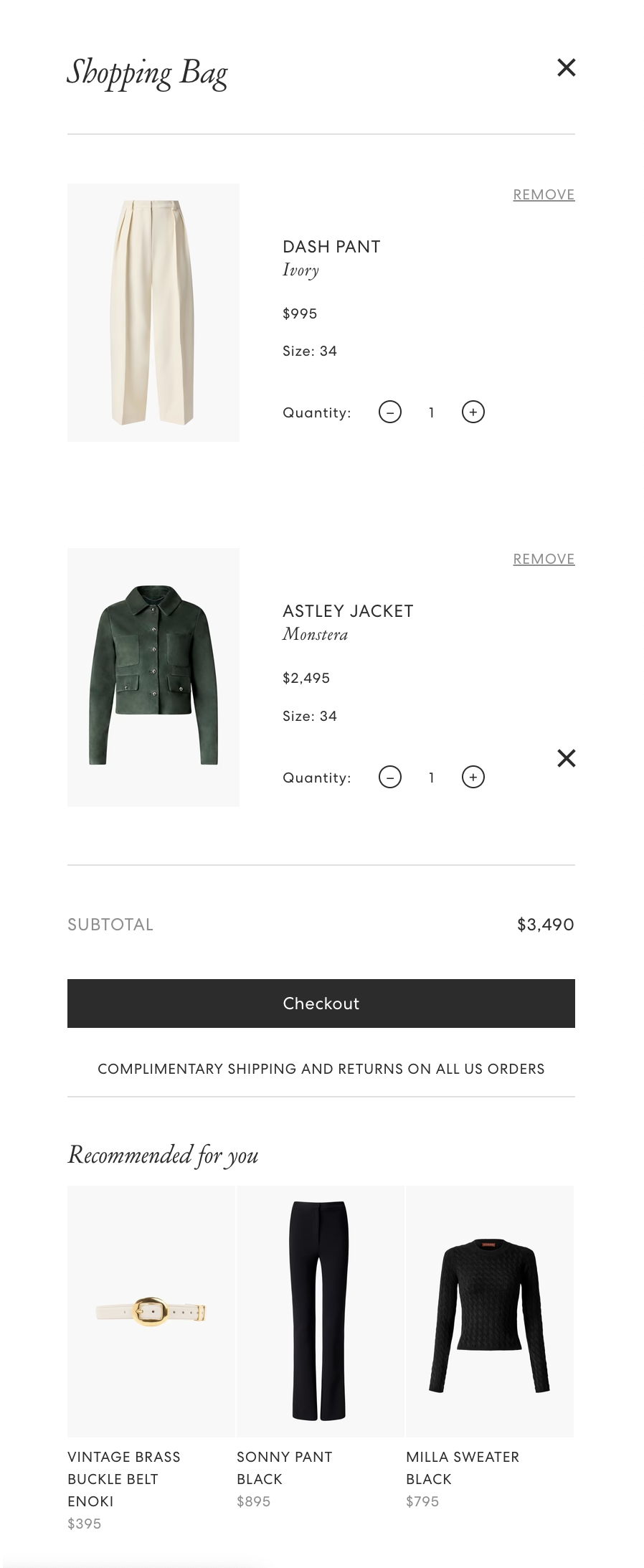
CaaStle's Borrow button lived on partner product detail pages, giving shoppers the option to rent rather than buy. But once clicked, users were pulled out of the partner's storefront entirely and dropped into CaaStle's order management site — a completely different visual environment — to complete their order.
The transition was jarring. Users lost the context of where they were shopping, and the sudden shift in branding undermined trust in the experience.
Our challenge: design a unified checkout that felt native to each partner's storefront while connecting seamlessly to CaaStle's backend infrastructure.
Project Role
- Co-led UX and UI design across wireframing, prototyping, and final specs in Figma
- Partnered with PMs and engineers to align design decisions with technical feasibility
- Collaborated with fellow designers to maintain consistency across partner implementations
- Defined a flexible design approach that could be tailored per brand without rebuilding from scratch
Process
Research and Insights
The problem was already well-evidenced before the project kicked off. User testing had surfaced consistent feedback: the shift from a partner's polished storefront to CaaStle's interface felt abrupt and out of place. Users described feeling like they'd accidentally left the site they were on. This wasn't a subtle UX issue — it was breaking trust at the exact moment a user was deciding whether to commit to a rental.
Design Challenges
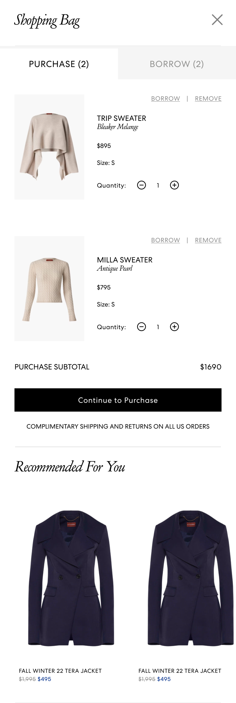
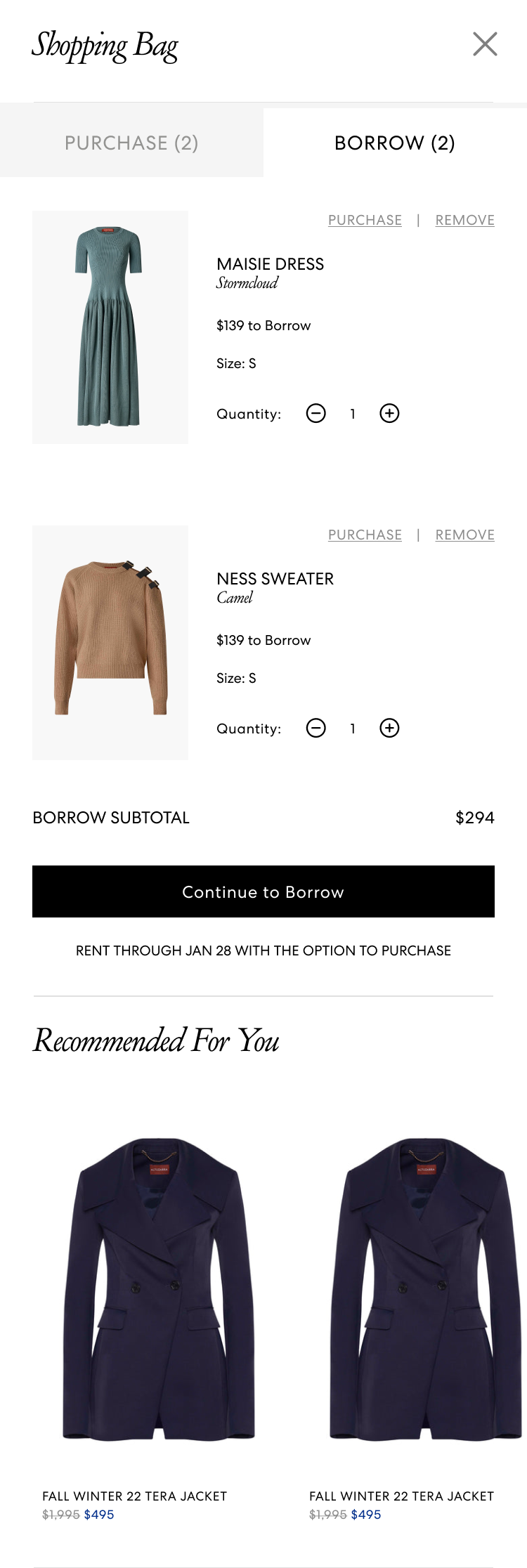
The solution sounds straightforward in principle: match the partner's branding. In practice, it meant the integrated cart and checkout couldn't be a single, one-size-fits-all design. Each implementation had to be tailored to fit the existing visual language of that partner's e-commerce experience — their typography, color palette, component patterns, and interaction conventions.
This added significant complexity to the design process. What worked for Altuzarra wouldn't automatically work for Vince. We had to build a system flexible enough to absorb those differences without requiring a full redesign from scratch for every new partner.
Design Solution
We designed a new carting experience and a Borrow checkout flow that adopted the branding of each partner site rather than imposing CaaStle's own visual identity. The user stays within a consistent brand environment from product discovery all the way through placing their rental order.
Altuzarra was our first implementation — a proof of concept that let us pressure-test the approach and establish a design framework we could carry forward. With Vince next in the pipeline, the work on Altuzarra wasn't just a one-off; it was laying the foundation for a scalable, partner-by-partner rollout.
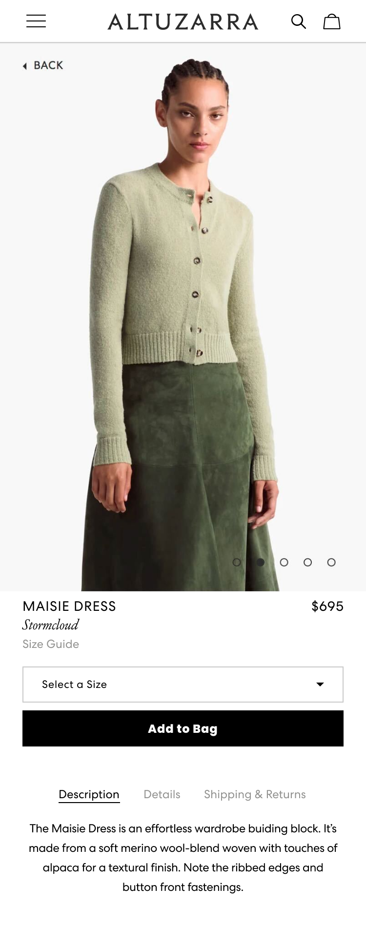
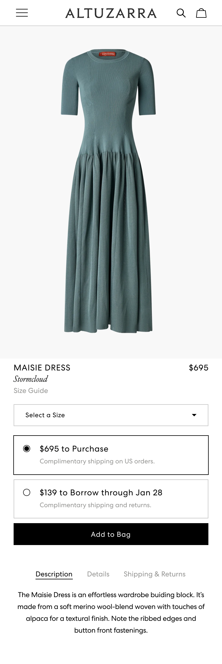
The original PDP (left); the newly designed PDP with both options to Add to Bag or to Borrow (middle, right)
Reflection
This project was a good reminder that cohesion is a feature. The Borrow button was already solving a real need — giving shoppers a lower-commitment way to try luxury pieces — but the disjointed handoff was quietly undermining it. By making the experience feel like a natural extension of where the user already was, we removed a layer of friction that was invisible on paper but very real in practice.
The per-partner customization requirement added scope, but it also pushed us toward a more thoughtful, systematic design approach. The groundwork laid with Altuzarra means each new partner integration gets a little easier.