As designers, we would love to follow, live, and breathe the product life cycle; that is, doing the user research to identify user problems, do the work to produce viable solutions, and implement the best solution given the constraints.
However, at times, this process just isn’t how things are done and different stakeholders will ask for different things and insist that their thing is the number one priority.
We had an example of that when the urgency was indeed high, given that the stakeholder was our team of attorneys and the urgency was due to compliance: we needed to have the user explicitly accept that they were starting a subscription right at the "Subscribe" button, in addition to the Terms of Conditions that were already there.
Similar to certain bandaid fixes, we initially tried to just stick the messaging in the screens that we already had.

Quickly, we realized this wasn't putting our best foot forward. We took a step back and looked at the problem we were trying to solve:
How do we make this opt-in explicit for the user so they know exactly what they're opting in for?
The "exactly" qualifier pointed out challenges that we had previously seen in our onboarding flows: users were going through each screen with more questions instead of answers. Even though the payment screen had a breakdown of what they were getting every month, it didn't explain how their membership actually worked.
It was a problem with which we designers constantly took issue because, for the user, the flow wasn't informative enough. However, this problem was seen as part of a bigger project — to overhaul the entire onboarding flow — which had lower priority in our team's pipeline (much to our dismay).
However, with this very urgent requirement from the legal team, it shot up to priority number one and we had the opportunity to design the flow in a way that would better inform the user.
A couple of years prior, at Config 2023, we were inspired by Blinkist's transparent onboarding flow. We left that talk absolutely inspired and knew that it was definitely something our onboarding flow needed to adopt. We finally had the opportunity to implement it.
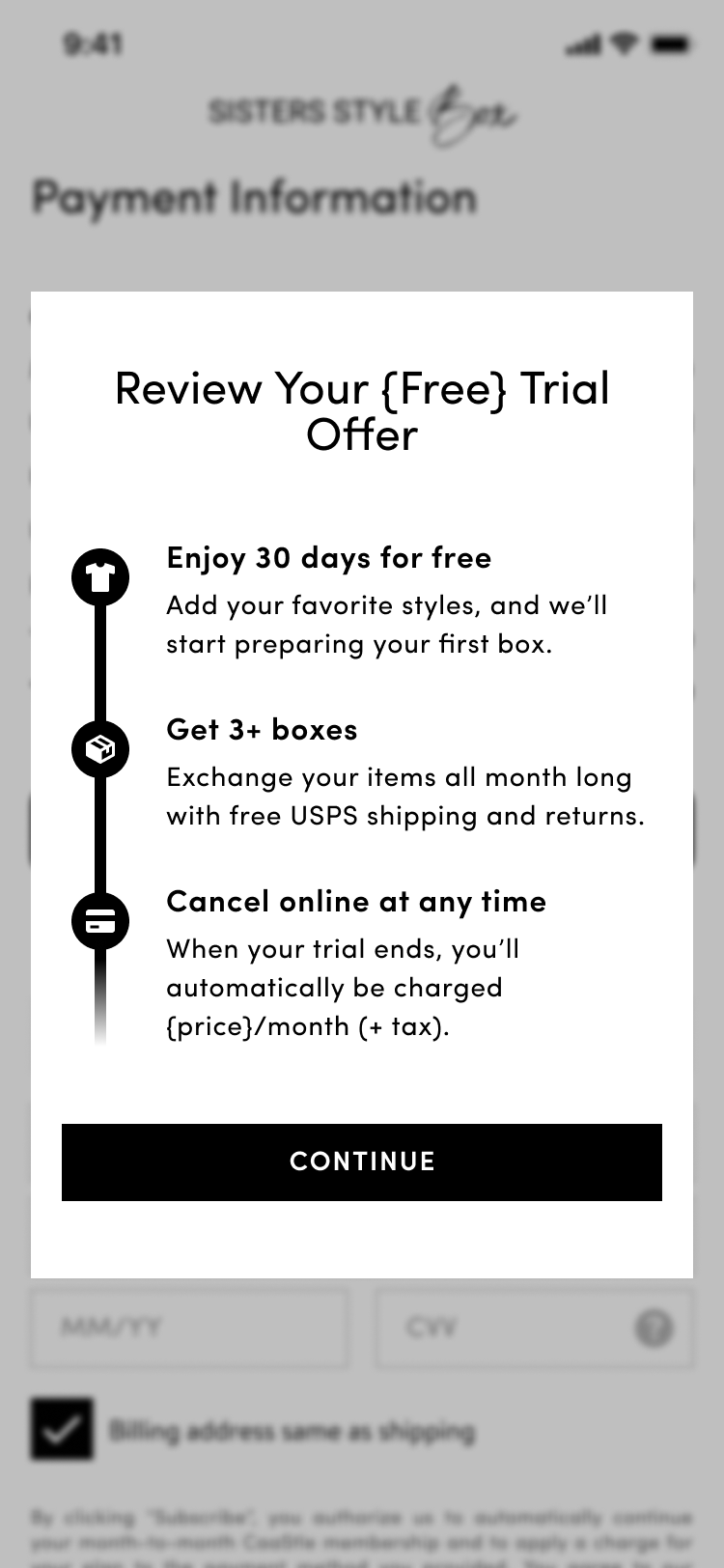
While we didn't overhaul the onboarding flow, we were able to both add clear messaging of their trial and their consent to get automatically charged at the end of their trial.
Stakeholders happy, designers happy, and users happy less confused! That's a win to me.